Run details
- Model
- x-ai/grok-4.7
- Route
- OpenRouter API, one user message
- Served by
- xAI
- Effort
- high, OpenRouter's default for this model
- Limits
- 60 min · 250,000 output tokens (the model's limit)
- Date
- 23 Oct 2026
- Time
- 4 min 8 s
- Size
- 16 kB
- Tokens
- 1,319 in, 25,215 out (19,017 of them thinking)
- List price
- $0.15 at today's price ($2 in / $6 out per M)
- Paid
- $0.15
Exact prompt
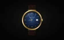
Draw a mechanical wristwatch that shows the current local time, with a sweeping seconds hand and a date window. Make it look expensive.

It must be one complete, self-contained HTML file: inline all CSS and JavaScript, and make no network requests of any kind (no CDNs, web fonts or remote images). Reply with the file in a single ```html code block.
Source
16 kB 589 lines Raw
<!DOCTYPE html>
<html lang="en">
<head>
<meta charset="utf-8">
<meta name="viewport" content="width=device-width, initial-scale=1">
<title>Aurelia Genève</title>
<style>
  :root {
    --gold-hi: #fff6df;
    --gold: #e4cb8e;
    --gold-mid: #b89045;
    --gold-deep: #6e5324;
    --ink: #e8d7b0;
  }

  * { box-sizing: border-box; }

  html, body {
    margin: 0;
    height: 100%;
  }

  body {
    min-height: 100vh;
    display: grid;
    place-items: center;
    background:
      radial-gradient(ellipse 42% 36% at 50% 42%, rgba(120, 92, 48, 0.16), transparent 62%),
      radial-gradient(ellipse at 50% 48%, #161514 0%, #050505 72%);
    color: var(--ink);
    font-family: Palatino, "Palatino Linotype", "Book Antiqua", Georgia, serif;
    -webkit-font-smoothing: antialiased;
  }

  .stage {
    position: relative;
    width: 420px;
    height: 640px;
    display: grid;
    place-items: center;
    user-select: none;
  }

  .stage::after {
    content: "";
    position: absolute;
    left: 50%;
    bottom: 28px;
    width: 240px;
    height: 28px;
    transform: translateX(-50%);
    background: radial-gradient(ellipse, rgba(0, 0, 0, 0.55), transparent 70%);
    pointer-events: none;
  }

  .strap {
    position: absolute;
    left: 50%;
    top: 50%;
    width: 156px;
    height: 608px;
    transform: translate(-50%, -50%);
    border-radius: 18px;
    background-color: #2a1810;
    background-image:
      radial-gradient(ellipse 9px 13px at 14px 12px, rgba(255, 214, 160, 0.07) 0 38%, rgba(0, 0, 0, 0.28) 42% 46%, transparent 48%),
      radial-gradient(ellipse 9px 13px at 14px 12px, transparent 40%, rgba(0, 0, 0, 0.35) 70%),
      linear-gradient(90deg, rgba(255, 220, 170, 0.04), transparent 18%, transparent 82%, rgba(0, 0, 0, 0.35));
    background-size: 26px 24px, 26px 24px, 100% 100%;
    box-shadow:
      inset 10px 0 14px rgba(0, 0, 0, 0.35),
      inset -10px 0 14px rgba(0, 0, 0, 0.45),
      inset 0 0 0 1px rgba(90, 55, 28, 0.5);
    z-index: 0;
  }

  .strap::before,
  .strap::after {
    content: "";
    position: absolute;
    top: 22px;
    bottom: 22px;
    width: 2px;
    background: repeating-linear-gradient(#c4a36a 0 3px, transparent 3px 9px);
    opacity: 0.7;
  }

  .strap::before { left: 11px; }
  .strap::after { right: 11px; }

  .watch {
    position: relative;
    width: 400px;
    height: 400px;
    z-index: 1;
  }

  .lug {
    position: absolute;
    left: 50%;
    width: 176px;
    height: 54px;
    transform: translateX(-50%);
    background: linear-gradient(90deg, #5a431c, #c6a15e 28%, #fff1cc 48%, #d4b36a 58%, #6a5024 100%);
    z-index: 0;
  }

  .lug.top {
    top: -8px;
    clip-path: polygon(16% 100%, 2% 8%, 98% 8%, 84% 100%);
    border-radius: 8px 8px 0 0;
  }

  .lug.bot {
    bottom: -8px;
    clip-path: polygon(16% 0, 2% 92%, 98% 92%, 84% 0);
  }

  .case {
    position: absolute;
    inset: 0;
    border-radius: 50%;
    background:
      radial-gradient(circle at 32% 28%, rgba(255, 255, 255, 0.42), transparent 28%),
      repeating-linear-gradient(115deg, rgba(255, 255, 255, 0.045) 0 1px, transparent 1px 3px),
      conic-gradient(from 210deg,
        #5c451c 0deg,
        #c9a45c 28deg,
        #fff4d4 52deg,
        #a17c38 88deg,
        #f6e7c0 124deg,
        #7a5c28 168deg,
        #e7d09a 210deg,
        #4e3916 248deg,
        #f3e2b4 292deg,
        #8d6a30 330deg,
        #5c451c 360deg);
    box-shadow:
      inset 0 0 0 2px rgba(255, 244, 214, 0.35),
      inset 0 0 18px rgba(80, 50, 10, 0.35),
      0 22px 40px rgba(0, 0, 0, 0.55),
      0 4px 10px rgba(0, 0, 0, 0.45);
    z-index: 1;
  }

  .case-inner {
    position: absolute;
    inset: 16px;
    border-radius: 50%;
    background:
      radial-gradient(circle at 50% 42%, #3a332c, #141210 72%);
    box-shadow:
      inset 0 0 0 3px #8d6c34,
      inset 0 0 0 5px #f0e0b4,
      inset 0 0 0 8px #5a431c,
      inset 0 8px 18px rgba(0, 0, 0, 0.65);
    display: grid;
    place-items: center;
  }

  .dial {
    position: relative;
    width: 316px;
    height: 316px;
    border-radius: 50%;
    overflow: hidden;
    background:
      radial-gradient(circle at 50% 38%, #243f6e 0%, #142848 38%, #08111f 72%, #050a14 100%);
    box-shadow:
      inset 0 0 0 1px rgba(232, 208, 150, 0.28),
      inset 0 0 28px rgba(0, 0, 0, 0.45);
  }

  .guilloche,
  .grain,
  .track {
    position: absolute;
    inset: 0;
    width: 100%;
    height: 100%;
    pointer-events: none;
  }

  .guilloche { z-index: 1; opacity: 0.9; }
  .grain {
    z-index: 2;
    mix-blend-mode: overlay;
    opacity: 0.28;
  }
  .track { z-index: 3; }

  .indices { position: absolute; inset: 0; z-index: 4; pointer-events: none; }

  .index { position: absolute; inset: 0; transform: rotate(calc(var(--a) * 1deg)); }

  .index b {
    position: absolute;
    top: 11px;
    left: 50%;
    width: 5px;
    height: 16px;
    transform: translateX(-50%);
    border-radius: 1px;
    background: linear-gradient(90deg, #6a4f22, #f6e7c2 42%, #fff 50%, #c9a45c 60%, #5c4318);
    box-shadow: 0 1px 1px rgba(0, 0, 0, 0.65), inset 0 1px 0 rgba(255, 255, 255, 0.7);
  }

  .index.card b { width: 7px; height: 24px; top: 9px; }

  .brand, .origin, .mech, .swiss, .monogram {
    position: absolute;
    left: 50%;
    transform: translateX(-50%);
    text-align: center;
    z-index: 4;
    pointer-events: none;
    color: var(--ink);
  }

  .monogram { top: 21%; width: 28px; height: 28px; }
  .brand {
    top: 31%;
    font-size: 15px;
    letter-spacing: 0.42em;
    text-indent: 0.42em;
    font-weight: 600;
    color: #f4e6c4;
  }
  .origin {
    top: 37.5%;
    font-size: 8px;
    letter-spacing: 0.48em;
    text-indent: 0.48em;
    color: #cbb68a;
  }
  .mech {
    top: 61%;
    font-size: 8px;
    letter-spacing: 0.34em;
    text-indent: 0.34em;
    color: #d9c49a;
  }
  .swiss {
    top: 75.5%;
    font-size: 7px;
    letter-spacing: 0.32em;
    text-indent: 0.32em;
    color: #cbb68a;
  }

  .date-win {
    position: absolute;
    top: 50%;
    left: calc(50% + 102px);
    width: 34px;
    height: 24px;
    transform: translate(-50%, -50%);
    background: linear-gradient(#fffefb, #f3efe6);
    border-radius: 2px;
    box-shadow:
      0 0 0 1px #8a6a32,
      0 0 0 2px #f0e0b0,
      inset 0 1px 2px rgba(0, 0, 0, 0.28);
    display: grid;
    place-items: center;
    z-index: 5;
    font-family: "Helvetica Neue", Helvetica, Arial, sans-serif;
    font-size: 15px;
    font-weight: 560;
    letter-spacing: 0.02em;
    color: #1a1a1a;
  }

  .hand {
    position: absolute;
    left: 50%;
    top: 50%;
    z-index: 6;
    transform-origin: 50% 100%;
  }

  .hand i {
    display: block;
    height: 100%;
    background: linear-gradient(90deg, #5e451c 0%, #e8d5a4 36%, #fff8e6 50%, #c6a15c 64%, #4e3916 100%);
    box-shadow: 0 1px 2px rgba(0, 0, 0, 0.45);
  }

  .hand span {
    position: absolute;
    left: 50%;
    top: 20%;
    width: 1.5px;
    height: 46%;
    transform: translateX(-50%);
    background: rgba(248, 244, 232, 0.92);
    border-radius: 1px;
    box-shadow: 0 0 4px rgba(248, 244, 232, 0.35);
  }

  #hour {
    width: 10px;
    height: 90px;
    margin-left: -5px;
    margin-top: -90px;
  }
  #hour i { clip-path: polygon(50% 0, 92% 100%, 8% 100%); }
  #hour::after {
    content: "";
    position: absolute;
    left: 50%;
    top: 100%;
    width: 4px;
    height: 14px;
    transform: translateX(-50%);
    background: linear-gradient(90deg, #5c4318, #e6d3a0, #5c4318);
    border-radius: 0 0 2px 2px;
  }

  #minute {
    width: 7px;
    height: 124px;
    margin-left: -3.5px;
    margin-top: -124px;
    z-index: 7;
  }
  #minute i { clip-path: polygon(50% 0, 100% 100%, 0 100%); }
  #minute::after {
    content: "";
    position: absolute;
    left: 50%;
    top: 100%;
    width: 3px;
    height: 16px;
    transform: translateX(-50%);
    background: linear-gradient(90deg, #5c4318, #e6d3a0, #5c4318);
    border-radius: 0 0 2px 2px;
  }

  #second {
    width: 1.5px;
    height: 176px;
    margin-left: -0.75px;
    margin-top: -146px;
    transform-origin: 50% 146px;
    z-index: 8;
    background: linear-gradient(to bottom,
      transparent 0 15px,
      #d7dee8 15px,
      #aeb6c2 calc(100% - 18px),
      transparent calc(100% - 18px));
    box-shadow: none;
  }

  #second::before {
    content: "";
    position: absolute;
    top: 1px;
    left: 50%;
    width: 11px;
    height: 11px;
    margin-left: -5.5px;
    border-radius: 50%;
    border: 1.25px solid #e4eaf2;
    box-shadow: 0 0 0 0.5px rgba(0, 0, 0, 0.35), inset 0 0 0 0.5px rgba(255, 255, 255, 0.3);
  }

  #second::after {
    content: "";
    position: absolute;
    bottom: 1px;
    left: 50%;
    width: 11px;
    height: 11px;
    margin-left: -5.5px;
    border-radius: 50%;
    background: radial-gradient(circle at 35% 32%, #fff6df, #c6a15c 46%, #5c4318 78%);
    box-shadow: 0 1px 2px rgba(0, 0, 0, 0.5);
  }

  .pinion {
    position: absolute;
    left: 50%;
    top: 50%;
    width: 14px;
    height: 14px;
    transform: translate(-50%, -50%);
    border-radius: 50%;
    z-index: 9;
    background:
      radial-gradient(circle at 35% 32%, #fff8e8, #e0c27a 36%, #8a6830 70%, #3e2c12);
    box-shadow:
      0 0 0 2px rgba(20, 16, 10, 0.55),
      0 1px 2px rgba(0, 0, 0, 0.6);
  }

  .cyclops {
    position: absolute;
    top: 50%;
    left: calc(50% + 102px);
    width: 46px;
    height: 46px;
    transform: translate(-50%, -50%);
    border-radius: 50%;
    z-index: 10;
    pointer-events: none;
    background:
      radial-gradient(circle at 34% 30%, rgba(255, 255, 255, 0.55), rgba(255, 255, 255, 0.08) 28%, rgba(170, 198, 230, 0.08) 62%, transparent 70%);
    box-shadow:
      inset 0 0 0 1px rgba(255, 255, 255, 0.28),
      inset 0 -6px 8px rgba(40, 70, 110, 0.12),
      0 2px 5px rgba(0, 0, 0, 0.25);
  }

  .glass {
    position: absolute;
    inset: 0;
    border-radius: 50%;
    z-index: 11;
    pointer-events: none;
    background: linear-gradient(128deg, rgba(255, 255, 255, 0.32) 0%, rgba(255, 255, 255, 0.07) 15%, transparent 32%);
    box-shadow:
      inset 0 0 0 1px rgba(255, 255, 255, 0.12),
      inset 0 0 36px rgba(0, 0, 0, 0.28);
  }

  .glass::after {
    content: "";
    position: absolute;
    left: 16%;
    top: 7%;
    width: 48%;
    height: 26%;
    border-radius: 50%;
    background: linear-gradient(180deg, rgba(255, 255, 255, 0.22), transparent 80%);
    transform: rotate(-16deg);
    filter: blur(0.5px);
  }

  .crown {
    position: absolute;
    right: -16px;
    top: 50%;
    width: 18px;
    height: 46px;
    transform: translateY(-50%);
    border-radius: 0 5px 5px 0;
    z-index: 4;
    background: repeating-linear-gradient(
      #f3e6c4 0 2px,
      #a7843e 2px 3.5px,
      #6a5122 3.5px 5px
    );
    box-shadow:
      inset -2px 0 2px rgba(0, 0, 0, 0.35),
      2px 2px 4px rgba(0, 0, 0, 0.35);
  }

  .crown::before {
    content: "";
    position: absolute;
    left: -8px;
    top: 13px;
    width: 10px;
    height: 20px;
    background: linear-gradient(#e8d5a4, #7a5c28);
    box-shadow: inset 0 1px 0 rgba(255, 255, 255, 0.4);
  }

  .sr {
    position: absolute;
    width: 1px;
    height: 1px;
    overflow: hidden;
    clip: rect(0 0 0 0);
  }

  @media (max-width: 520px), (max-height: 700px) {
    .stage { transform: scale(0.72); }
  }
</style>
</head>
<body>
  <div class="stage">
    <div class="strap" aria-hidden="true"></div>
    <div class="watch" role="img" aria-label="Aurelia Genève mechanical wristwatch">
      <div class="lug top"></div>
      <div class="lug bot"></div>
      <div class="case">
        <div class="crown" aria-hidden="true"></div>
        <div class="case-inner">
          <div class="dial">
            <svg class="guilloche" viewBox="0 0 100 100" aria-hidden="true">
              <defs>
                <pattern id="wave" width="6" height="6" patternUnits="userSpaceOnUse">
                  <path d="M0 6 Q1.5 3 3 6 T6 6" fill="none" stroke="rgba(190,214,240,0.16)" stroke-width="0.35"/>
                  <path d="M0 3 Q1.5 0 3 3 T6 3" fill="none" stroke="rgba(190,214,240,0.08)" stroke-width="0.3"/>
                </pattern>
              </defs>
              <circle cx="50" cy="50" r="50" fill="url(#wave)"/>
            </svg>
            <svg class="grain" viewBox="0 0 100 100" preserveAspectRatio="none" aria-hidden="true">
              <filter id="grain">
                <feTurbulence type="fractalNoise" baseFrequency="0.9" numOctaves="2" stitchTiles="stitch"/>
                <feColorMatrix type="saturate" values="0"/>
              </filter>
              <rect width="100%" height="100%" filter="url(#grain)"/>
            </svg>
            <svg class="track" viewBox="0 0 100 100" aria-hidden="true">
              <circle cx="50" cy="50" r="47.6" fill="none" stroke="rgba(232,210,150,0.62)" stroke-width="0.38"
                stroke-dasharray="0.16 0.84" pathLength="60"/>
              <circle cx="50" cy="50" r="46.2" fill="none" stroke="rgba(232,210,150,0.28)" stroke-width="0.45"/>
            </svg>
            <div class="indices" aria-hidden="true">
              <div class="index card" style="--a:0"><b></b></div>
              <div class="index" style="--a:30"><b></b></div>
              <div class="index" style="--a:60"><b></b></div>
              <div class="index" style="--a:120"><b></b></div>
              <div class="index" style="--a:150"><b></b></div>
              <div class="index card" style="--a:180"><b></b></div>
              <div class="index" style="--a:210"><b></b></div>
              <div class="index" style="--a:240"><b></b></div>
              <div class="index card" style="--a:270"><b></b></div>
              <div class="index" style="--a:300"><b></b></div>
              <div class="index" style="--a:330"><b></b></div>
            </div>
            <svg class="monogram" viewBox="0 0 40 40" aria-hidden="true">
              <circle cx="20" cy="20" r="12.5" fill="none" stroke="#e4cb8e" stroke-width="0.6"/>
              <path d="M20 9.5 L22.2 16.2 H29 L23.6 20.2 L25.6 27 L20 23.2 L14.4 27 L16.4 20.2 L11 16.2 H17.8 Z" fill="#e4cb8e"/>
            </svg>
            <div class="brand">AURELIA</div>
            <div class="origin">GENÈVE</div>
            <div class="mech">MECHANICAL</div>
            <div class="swiss">SWISS MADE</div>
            <div class="date-win" id="date">01</div>
            <div class="hand" id="hour"><i></i><span></span></div>
            <div class="hand" id="minute"><i></i><span></span></div>
            <div class="hand" id="second"></div>
            <div class="pinion" aria-hidden="true"></div>
            <div class="cyclops" aria-hidden="true"></div>
            <div class="glass" aria-hidden="true"></div>
          </div>
        </div>
      </div>
    </div>
    <div class="sr" id="spoken" aria-live="polite"></div>
  </div>
  <script>
    (function () {
      var hourEl = document.getElementById("hour");
      var minuteEl = document.getElementById("minute");
      var secondEl = document.getElementById("second");
      var dateEl = document.getElementById("date");
      var spoken = document.getElementById("spoken");
      var lastDate = -1;
      var lastMinute = -1;

      function pad(n) { return n < 10 ? "0" + n : String(n); }

      function frame() {
        var now = new Date();
        var sec = now.getSeconds() + now.getMilliseconds() / 1000;
        var min = now.getMinutes() + sec / 60;
        var hr = (now.getHours() % 12) + min / 60;

        hourEl.style.transform = "rotate(" + (hr * 30) + "deg)";
        minuteEl.style.transform = "rotate(" + (min * 6) + "deg)";
        secondEl.style.transform = "rotate(" + (sec * 6) + "deg)";

        var d = now.getDate();
        if (d !== lastDate) {
          lastDate = d;
          dateEl.textContent = pad(d);
        }

        var minuteKey = now.getHours() * 60 + now.getMinutes();
        if (minuteKey !== lastMinute) {
          lastMinute = minuteKey;
          spoken.textContent = "Local time " + pad(now.getHours()) + ":" + pad(now.getMinutes()) + ", date " + d;
        }

        requestAnimationFrame(frame);
      }

      requestAnimationFrame(frame);
    })();
  </script>
</body>
</html>