Run details
- Model
- opencode/longcat-2.5-preview-free
- Route
- opencode CLI
- Reasoning
- provider default
- Limits
- 60 min · 131,072 output tokens
- Date
- 2 Oct 2026
- Time
- 1 min 30 s
- Size
- 9.5 kB
- Tokens
- 19,583 in, 4,521 out
- Paid
- Not billed per run (CLI plan)
Exact prompt
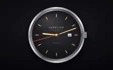
Draw a mechanical wristwatch that shows the current local time, with a sweeping seconds hand and a date window. Make it look expensive.

It must be one complete, self-contained HTML file: inline all CSS and JavaScript, and make no network requests of any kind (no CDNs, web fonts or remote images). Save it as index.html in the current directory, then stop. Do not ask questions.
Source
9.5 kB 333 lines Raw
<!DOCTYPE html>
<html lang="en">
<head>
<meta charset="UTF-8">
<meta name="viewport" content="width=device-width, initial-scale=1.0">
<title>Chronographe</title>
<style>
  * { margin: 0; padding: 0; box-sizing: border-box; }

  html, body {
    height: 100%;
    background: #0b0b0d;
    overflow: hidden;
    font-family: Georgia, 'Times New Roman', serif;
  }

  .scene {
    height: 100%;
    display: flex;
    align-items: center;
    justify-content: center;
    background:
      radial-gradient(ellipse 90% 70% at 50% 38%, #1c1c22 0%, #101014 45%, #060608 100%);
  }

  .watch {
    position: relative;
    width: min(88vmin, 640px);
    aspect-ratio: 1;
  }

  .case {
    position: absolute;
    inset: 0;
    border-radius: 50%;
    background:
      conic-gradient(from 210deg,
        #6d6d74 0%, #e8e8ec 8%, #9a9aa2 16%, #f4f4f7 24%,
        #7a7a82 33%, #dcdce2 41%, #8b8b93 50%, #efefF3 58%,
        #76767e 67%, #d5d5db 75%, #94949c 84%, #e2e2e8 92%,
        #6d6d74 100%);
    box-shadow:
      0 30px 80px rgba(0,0,0,.85),
      0 8px 24px rgba(0,0,0,.7),
      inset 0 2px 3px rgba(255,255,255,.55),
      inset 0 -3px 6px rgba(0,0,0,.45);
  }

  .case::before {
    content: '';
    position: absolute;
    inset: 3.2%;
    border-radius: 50%;
    background: conic-gradient(from 30deg,
      #3a3a40, #84848c 12%, #4a4a52 25%, #9c9ca4 38%,
      #3f3f46 50%, #8e8e96 62%, #48484f 75%, #a2a2aa 88%, #3a3a40);
    box-shadow:
      inset 0 3px 8px rgba(0,0,0,.6),
      inset 0 -1px 2px rgba(255,255,255,.25);
  }

  .case::after {
    content: '';
    position: absolute;
    inset: 6.5%;
    border-radius: 50%;
    background: linear-gradient(145deg, #26262b, #17171b 60%, #1e1e23);
    box-shadow:
      inset 0 4px 10px rgba(0,0,0,.8),
      inset 0 -2px 4px rgba(255,255,255,.08);
  }

  .crown {
    position: absolute;
    right: -3.4%;
    top: 50%;
    transform: translateY(-50%);
    width: 7%;
    height: 11%;
    border-radius: 14%;
    background: repeating-linear-gradient(90deg,
      #55555c 0 12%, #b9b9c1 12% 20%, #4a4a51 20% 32%, #c6c6ce 32% 40%);
    box-shadow:
      2px 4px 10px rgba(0,0,0,.7),
      inset 0 1px 1px rgba(255,255,255,.4);
    z-index: 5;
  }

  .crown::before {
    content: '';
    position: absolute;
    left: -38%;
    top: 50%;
    transform: translateY(-50%);
    width: 40%;
    height: 55%;
    border-radius: 20%;
    background: linear-gradient(90deg, #3c3c42, #6a6a72);
  }

  .dial-wrap {
    position: absolute;
    inset: 9%;
    border-radius: 50%;
    overflow: hidden;
    box-shadow:
      inset 0 6px 18px rgba(0,0,0,.75),
      inset 0 -3px 8px rgba(0,0,0,.5);
  }

  svg.dial {
    width: 100%;
    height: 100%;
    display: block;
  }

  .hand {
    position: absolute;
    left: 50%;
    bottom: 50%;
    transform-origin: 50% 100%;
    will-change: transform;
    z-index: 10;
  }

  .hand.hour {
    width: 4.6%;
    height: 26%;
    margin-left: -2.3%;
    background: linear-gradient(90deg,
      #8a6a1e 0%, #f5d76e 30%, #fff3b0 50%, #f5d76e 70%, #8a6a1e 100%);
    clip-path: polygon(50% 0%, 78% 12%, 68% 100%, 32% 100%, 22% 12%);
    box-shadow: 0 2px 5px rgba(0,0,0,.55);
    border-radius: 40% 40% 0 0;
  }

  .hand.minute {
    width: 3.2%;
    height: 38%;
    margin-left: -1.6%;
    background: linear-gradient(90deg,
      #8a6a1e 0%, #f5d76e 30%, #fff3b0 50%, #f5d76e 70%, #8a6a1e 100%);
    clip-path: polygon(50% 0%, 74% 8%, 66% 100%, 34% 100%, 26% 8%);
    box-shadow: 0 2px 5px rgba(0,0,0,.55);
    border-radius: 40% 40% 0 0;
  }

  .hand.second {
    width: 0.9%;
    height: 44%;
    margin-left: -0.45%;
    background: linear-gradient(180deg, #c93a2e 0%, #e8563f 55%, #a02a1e 100%);
    box-shadow: 0 1px 4px rgba(0,0,0,.5);
    z-index: 11;
  }

  .hand.second::before {
    content: '';
    position: absolute;
    left: 50%;
    bottom: -14%;
    transform: translateX(-50%);
    width: 260%;
    height: 16%;
    border-radius: 50%;
    background: radial-gradient(circle at 35% 35%, #e8563f, #8c2418);
    box-shadow: 0 1px 3px rgba(0,0,0,.5);
  }

  .hand.second::after {
    content: '';
    position: absolute;
    left: 50%;
    top: -10%;
    transform: translateX(-50%);
    width: 10%;
    height: 10%;
    border-radius: 50%;
    background: #c93a2e;
  }

  .pin {
    position: absolute;
    left: 50%;
    top: 50%;
    width: 4.5%;
    height: 4.5%;
    transform: translate(-50%, -50%);
    border-radius: 50%;
    background: radial-gradient(circle at 35% 30%, #fff3b0, #d4af37 45%, #6e5210);
    box-shadow: 0 1px 4px rgba(0,0,0,.6);
    z-index: 12;
  }

  .glass {
    position: absolute;
    inset: 9%;
    border-radius: 50%;
    pointer-events: none;
    z-index: 20;
    background:
      radial-gradient(ellipse 55% 32% at 30% 18%, rgba(255,255,255,.14) 0%, rgba(255,255,255,.04) 55%, transparent 75%),
      radial-gradient(ellipse 120% 90% at 50% 115%, rgba(0,0,0,.28) 0%, transparent 55%);
  }

  .glass::after {
    content: '';
    position: absolute;
    inset: 0;
    border-radius: 50%;
    box-shadow: inset 0 0 40px rgba(0,0,0,.35);
  }
</style>
</head>
<body>
<div class="scene">
  <div class="watch">
    <div class="case"></div>
    <div class="crown"></div>
    <div class="dial-wrap">
      <svg class="dial" viewBox="0 0 400 400">
        <defs>
          <radialGradient id="faceGrad" cx="50%" cy="42%" r="65%">
            <stop offset="0%" stop-color="#2b2b31"/>
            <stop offset="55%" stop-color="#1a1a1f"/>
            <stop offset="100%" stop-color="#0e0e12"/>
          </radialGradient>
          <pattern id="guilloche" width="6" height="6" patternUnits="userSpaceOnUse">
            <circle cx="3" cy="3" r="2.6" fill="none" stroke="rgba(255,255,255,.045)" stroke-width="1"/>
          </pattern>
          <linearGradient id="gold" x1="0" y1="0" x2="0" y2="1">
            <stop offset="0%" stop-color="#f7e08a"/>
            <stop offset="50%" stop-color="#d4af37"/>
            <stop offset="100%" stop-color="#8a6a1e"/>
          </linearGradient>
        </defs>

        <circle cx="200" cy="200" r="196" fill="url(#faceGrad)"/>
        <circle cx="200" cy="200" r="196" fill="url(#guilloche)"/>
        <circle cx="200" cy="200" r="196" fill="none" stroke="rgba(255,255,255,.07)" stroke-width="1"/>

        <g id="minuteTrack"></g>
        <g id="hourMarkers"></g>

        <text x="200" y="140" text-anchor="middle" fill="#d8c98a"
              font-family="Georgia, serif" font-size="17" letter-spacing="5">AURELION</text>
        <text x="200" y="160" text-anchor="middle" fill="#8f8f98"
              font-family="Georgia, serif" font-size="8.5" letter-spacing="3.5">CHRONOMÈTRE</text>
        <text x="200" y="272" text-anchor="middle" fill="#8f8f98"
              font-family="Georgia, serif" font-size="8" letter-spacing="2.5">AUTOMATIC</text>

        <g>
          <rect x="296" y="186" width="34" height="28" rx="3"
                fill="#f2efe6" stroke="#0a0a0c" stroke-width="2.5"/>
          <rect x="298.5" y="188.5" width="29" height="23" rx="2"
                fill="none" stroke="rgba(0,0,0,.25)" stroke-width="1"/>
          <text id="dateText" x="313" y="207" text-anchor="middle"
                font-family="Georgia, serif" font-size="17" font-weight="bold"
                fill="#141416">1</text>
        </g>
      </svg>
    </div>

    <div class="hand hour" id="hourHand"></div>
    <div class="hand minute" id="minuteHand"></div>
    <div class="hand second" id="secondHand"></div>
    <div class="pin"></div>
    <div class="glass"></div>
  </div>
</div>

<script>
  const NS = 'http://www.w3.org/2000/svg';
  const minuteTrack = document.getElementById('minuteTrack');
  const hourMarkers = document.getElementById('hourMarkers');

  for (let i = 0; i < 60; i++) {
    const angle = i * 6;
    const isHour = i % 5 === 0;
    const line = document.createElementNS(NS, 'line');
    const r1 = isHour ? 172 : 180;
    const r2 = 188;
    const rad = (angle - 90) * Math.PI / 180;
    line.setAttribute('x1', 200 + r1 * Math.cos(rad));
    line.setAttribute('y1', 200 + r1 * Math.sin(rad));
    line.setAttribute('x2', 200 + r2 * Math.cos(rad));
    line.setAttribute('y2', 200 + r2 * Math.sin(rad));
    line.setAttribute('stroke', isHour ? '#d8c98a' : 'rgba(216,201,138,.45)');
    line.setAttribute('stroke-width', isHour ? 2.4 : 1);
    minuteTrack.appendChild(line);
  }

  for (let i = 0; i < 12; i++) {
    const angle = i * 30;
    const g = document.createElementNS(NS, 'g');
    g.setAttribute('transform', `rotate(${angle} 200 200)`);
    const marker = document.createElementNS(NS, 'rect');
    marker.setAttribute('x', 196.5);
    marker.setAttribute('y', 22);
    marker.setAttribute('width', 7);
    marker.setAttribute('height', 26);
    marker.setAttribute('rx', 2);
    marker.setAttribute('fill', 'url(#gold)');
    marker.setAttribute('stroke', 'rgba(0,0,0,.5)');
    marker.setAttribute('stroke-width', .8);
    g.appendChild(marker);
    hourMarkers.appendChild(g);
  }

  const hourHand = document.getElementById('hourHand');
  const minuteHand = document.getElementById('minuteHand');
  const secondHand = document.getElementById('secondHand');
  const dateText = document.getElementById('dateText');

  function tick() {
    const now = new Date();
    const ms = now.getMilliseconds();
    const s = now.getSeconds() + ms / 1000;
    const m = now.getMinutes() + s / 60;
    const h = (now.getHours() % 12) + m / 60;

    secondHand.style.transform = `rotate(${s * 6}deg)`;
    minuteHand.style.transform = `rotate(${m * 6}deg)`;
    hourHand.style.transform = `rotate(${h * 30}deg)`;
    dateText.textContent = now.getDate();

    requestAnimationFrame(tick);
  }

  requestAnimationFrame(tick);
</script>
</body>
</html>
LongCat 2.5 Preview: other attempts
- LongCat 2.5 Preview, Pelican: Not run: no OpenRouter route

- About · 144 words