Run details
- Model
- tencent/hy4
- Route
- OpenRouter API, one user message
- Served by
- Tencent
- Effort
- high, OpenRouter's default for this model
- Limits
- 60 min · 65,536 output tokens (the model's limit)
- Date
- 7 Nov 2026
- Time
- 2 min 35 s
- Size
- 17 kB
- Tokens
- 96 in, 21,979 out (15,766 of them thinking)
- List price
- $0.028 at today's price ($0.417 in / $1.25 out per M)
- Paid
- $0.028
Exact prompt
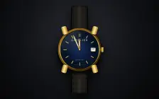
Draw a mechanical wristwatch that shows the current local time, with a sweeping seconds hand and a date window. Make it look expensive.

It must be one complete, self-contained HTML file: inline all CSS and JavaScript, and make no network requests of any kind (no CDNs, web fonts or remote images). Reply with the file in a single ```html code block.
Source
17 kB 548 lines Raw
<!DOCTYPE html>
<html lang="en">
<head>
<meta charset="UTF-8">
<meta name="viewport" content="width=device-width, initial-scale=1.0">
<title>Aurélien Genève - Automatic</title>
<style>
  :root {
    --gold-bright: #ffeca0;
    --gold-base: #d4af37;
    --gold-mid: #aa771c;
    --gold-dark: #4a2f05;
    --dial-blue: #112a5c;
    --dial-dark: #01040a;
    --lume: #e8eedd;
  }

  body {
    margin: 0;
    height: 100vh;
    display: flex;
    align-items: center;
    justify-content: center;
    background: radial-gradient(circle at 50% 35%, #2a2d34 0%, #111317 55%, #050506 100%);
    overflow: hidden;
    font-family: "Didot", "Bodoni MT", "Times New Roman", serif;
    user-select: none;
  }

  /* ---------------- ASSEMBLY ---------------- */
  .watch-container {
    position: relative;
    width: 340px;
    height: 340px;
    filter: drop-shadow(0 40px 50px rgba(0, 0, 0, 0.85));
  }

  /* ---------------- STRAP ---------------- */
  .strap {
    position: absolute;
    left: 50%;
    width: 144px;
    height: 220px;
    margin-left: -72px;
    z-index: 1;
    box-shadow: inset 0 0 25px rgba(0, 0, 0, 0.95);
    /* Alligator scale texture */
    background-image:
      radial-gradient(ellipse at 50% 15%, rgba(255,255,255,0.035) 0%, transparent 45%),
      radial-gradient(ellipse at 25% 40%, rgba(255,255,255,0.025) 0%, transparent 35%),
      radial-gradient(ellipse at 75% 40%, rgba(255,255,255,0.025) 0%, transparent 35%),
      linear-gradient(90deg, #080808, #1a1815 20%, #2a2520 50%, #1a1815 80%, #080808);
    background-size: 46px 46px, 46px 46px, 46px 46px, 100% 100%;
  }
  .strap::before {
    content: '';
    position: absolute;
    inset: 0 14px;
    border-left: 2px dashed #8a6d3b;
    border-right: 2px dashed #8a6d3b;
    opacity: 0.55;
  }
  .strap.top {
    top: -205px;
    border-radius: 24px 24px 0 0;
    transform: perspective(600px) rotateX(12deg);
    transform-origin: bottom center;
  }
  .strap.bottom {
    bottom: -205px;
    border-radius: 0 0 24px 24px;
    transform: perspective(600px) rotateX(-12deg);
    transform-origin: top center;
  }

  /* ---------------- CASE & LUGS ---------------- */
  .watch-case {
    position: relative;
    width: 100%;
    height: 100%;
    border-radius: 50%;
    z-index: 5;
    background: conic-gradient(
      from 210deg,
      var(--gold-dark) 0deg, var(--gold-mid) 30deg, var(--gold-bright) 50deg, var(--gold-base) 70deg,
      var(--gold-dark) 110deg, var(--gold-mid) 150deg, var(--gold-bright) 180deg, var(--gold-base) 210deg,
      var(--gold-dark) 250deg, var(--gold-mid) 290deg, var(--gold-bright) 320deg, var(--gold-base) 350deg,
      var(--gold-dark) 360deg
    );
    border: 1px solid var(--gold-dark);
    box-shadow:
      0 10px 20px rgba(0,0,0,0.7),
      inset 0 2px 4px rgba(255,255,255,0.5);
  }
  /* Mid-case thickness */
  .watch-case::before {
    content: '';
    position: absolute;
    inset: -4px;
    border-radius: 50%;
    background: linear-gradient(135deg, var(--gold-mid), #2a1a02);
    z-index: -3;
    box-shadow: 0 18px 30px rgba(0,0,0,0.9);
  }

  .lug {
    position: absolute;
    width: 42px;
    height: 65px;
    background: linear-gradient(90deg, var(--gold-mid), var(--gold-bright) 45%, var(--gold-mid));
    z-index: 2;
    border-radius: 12px;
    box-shadow: 0 6px 12px rgba(0,0,0,0.6), inset 0 1px 2px rgba(255,255,255,0.4);
  }
  .lug.tl { top: -18px; left: 28px; transform: rotate(-16deg); }
  .lug.tr { top: -18px; right: 28px; transform: rotate(16deg); }
  .lug.bl { bottom: -18px; left: 28px; transform: rotate(16deg); }
  .lug.br { bottom: -18px; right: 28px; transform: rotate(-16deg); }

  /* ---------------- CROWN ---------------- */
  .crown-stem {
    position: absolute;
    top: 50%; right: -8px;
    transform: translateY(-50%);
    width: 10px; height: 18px;
    background: var(--gold-mid);
    z-index: -1;
  }
  .crown {
    position: absolute;
    top: 50%; right: -24px;
    transform: translateY(-50%);
    width: 20px; height: 38px;
    background: linear-gradient(90deg, var(--gold-mid), var(--gold-base) 25%, var(--gold-bright) 50%, var(--gold-base) 75%, var(--gold-dark));
    border-radius: 4px;
    box-shadow: 3px 4px 8px rgba(0,0,0,0.7), inset 0 1px 2px rgba(255,255,255,0.6);
    z-index: -1;
  }
  .crown::after {
    content: '';
    position: absolute;
    inset: 0;
    background: repeating-linear-gradient(0deg, transparent, transparent 2px, rgba(0,0,0,0.35) 2px, rgba(0,0,0,0.35) 3.5px);
    border-radius: 4px;
  }

  /* ---------------- BEZEL & DIAL ---------------- */
  .bezel-outer {
    position: absolute;
    inset: 8px;
    border-radius: 50%;
    background: conic-gradient(
      from 180deg,
      var(--gold-dark) 0deg, var(--gold-base) 60deg, var(--gold-bright) 90deg,
      var(--gold-mid) 120deg, var(--gold-dark) 180deg, var(--gold-base) 240deg,
      var(--gold-bright) 270deg, var(--gold-mid) 300deg, var(--gold-dark) 360deg
    );
    box-shadow: inset 0 1px 3px rgba(255,255,255,0.6), 0 2px 5px rgba(0,0,0,0.6);
    padding: 6px;
    box-sizing: border-box;
  }
  .bezel-inner {
    width: 100%; height: 100%;
    border-radius: 50%;
    background: #0c0c0c; /* Dark rehaut */
    box-shadow: inset 0 4px 10px rgba(0,0,0,0.95);
    padding: 4px;
    box-sizing: border-box;
  }
  .dial {
    position: relative;
    width: 100%; height: 100%;
    border-radius: 50%;
    background: radial-gradient(circle at 50% 50%, var(--dial-blue) 0%, #061022 55%, var(--dial-dark) 100%);
    overflow: hidden;
    box-shadow: 0 0 12px rgba(0,0,0,0.9);
  }

  /* Dial Textures */
  .dial::before {
    content: '';
    position: absolute;
    inset: 0;
    background: repeating-conic-gradient(from 0deg, rgba(255,255,255,0.035) 0deg, rgba(255,255,255,0) 1deg, rgba(255,255,255,0.035) 2deg);
    mix-blend-mode: overlay;
    z-index: 1;
  }
  .guilloche {
    position: absolute;
    inset: 32%;
    border-radius: 50%;
    background: repeating-radial-gradient(circle at 50% 50%, rgba(255,255,255,0.018) 0px, rgba(255,255,255,0.018) 1px, transparent 1px, transparent 3px);
    z-index: 1;
    pointer-events: none;
  }

  /* Printed Tracks */
  .minute-ticks {
    position: absolute;
    inset: 8px;
    border-radius: 50%;
    background: repeating-conic-gradient(from 0deg, rgba(212,175,55,0.65) 0deg 0.35deg, transparent 0.35deg 6deg);
    -webkit-mask: radial-gradient(transparent 95%, black 96%);
    mask: radial-gradient(transparent 95%, black 96%);
    z-index: 2;
  }
  .five-min-ticks {
    position: absolute;
    inset: 8px;
    border-radius: 50%;
    background: repeating-conic-gradient(from 0deg, var(--gold-bright) 0deg 0.9deg, transparent 0.9deg 30deg);
    -webkit-mask: radial-gradient(transparent 92%, black 93%);
    mask: radial-gradient(transparent 92%, black 93%);
    z-index: 2;
  }

  /* Applied Markers */
  .markers {
    position: absolute;
    inset: 0;
    z-index: 3;
  }
  .marker {
    position: absolute;
    top: 22px;
    left: 50%;
    width: 6px;
    height: 26px;
    margin-left: -3px;
    background: linear-gradient(90deg, var(--gold-dark), var(--gold-bright) 40%, #ffffff 50%, var(--gold-base) 60%, var(--gold-dark));
    border-radius: 1px;
    box-shadow: 1px 2px 3px rgba(0,0,0,0.7), inset 0 0 1px rgba(255,255,255,0.9);
    transform-origin: 50% 130px; /* Exact center of 304px dial */
  }
  .marker.double {
    width: 14px;
    margin-left: -7px;
    background: none;
    box-shadow: none;
    display: flex;
    justify-content: space-between;
  }
  .marker.double::before, .marker.double::after {
    content: '';
    width: 4px;
    height: 100%;
    background: linear-gradient(90deg, var(--gold-dark), var(--gold-bright) 40%, #ffffff 50%, var(--gold-base) 60%, var(--gold-dark));
    border-radius: 1px;
    box-shadow: 1px 2px 3px rgba(0,0,0,0.7);
  }

  /* Typography */
  .brand {
    position: absolute;
    top: 64px; width: 100%;
    text-align: center;
    font-size: 21px;
    letter-spacing: 4px;
    color: var(--gold-bright);
    text-shadow: 0 1px 2px rgba(0,0,0,0.9), 0 -1px 0 rgba(255,255,255,0.25);
    z-index: 3;
  }
  .brand-sub {
    position: absolute;
    top: 90px; width: 100%;
    text-align: center;
    font-family: Arial, sans-serif;
    font-size: 8px;
    letter-spacing: 5px;
    color: var(--gold-mid);
    z-index: 3;
  }
  .bottom-text {
    position: absolute;
    bottom: 64px; width: 100%;
    text-align: center;
    font-family: Arial, sans-serif;
    font-size: 9px;
    letter-spacing: 3px;
    color: var(--gold-base);
    z-index: 3;
  }
  .bottom-text-small {
    position: absolute;
    bottom: 26px; width: 100%;
    text-align: center;
    font-family: Arial, sans-serif;
    font-size: 7px;
    letter-spacing: 4px;
    color: var(--gold-mid);
    z-index: 3;
  }

  /* Date Window */
  .date-window {
    position: absolute;
    top: 50%; right: 25px;
    transform: translateY(-50%);
    width: 34px; height: 26px;
    background: linear-gradient(135deg, #ffffff 0%, #f2efe9 100%);
    box-shadow:
      inset 0 3px 5px rgba(0,0,0,0.45),
      inset 0 -1px 2px rgba(255,255,255,0.9),
      0 0 0 1.5px var(--gold-base),
      0 0 0 3px var(--gold-dark),
      3px 4px 7px rgba(0,0,0,0.7);
    display: flex;
    align-items: center;
    justify-content: center;
    border-radius: 2px;
    z-index: 4;
  }
  #date-value {
    font-size: 19px;
    color: #0a0a0a;
    text-shadow: 0 1px 0 rgba(255,255,255,0.9);
    transform: translateY(-1px);
  }

  /* ---------------- HANDS ---------------- */
  .hands {
    position: absolute;
    inset: 0;
    z-index: 10;
    pointer-events: none;
  }
  .hand {
    position: absolute;
    left: 50%;
    will-change: transform;
  }
  .hour-hand {
    bottom: 50%;
    transform-origin: 50% 100%;
    filter: drop-shadow(2px 4px 3px rgba(0,0,0,0.6));
  }
  .minute-hand {
    bottom: 50%;
    transform-origin: 50% 100%;
    filter: drop-shadow(2px 5px 3px rgba(0,0,0,0.6));
  }
  .second-hand {
    bottom: calc(50% - 30px); /* 30px tail below pivot */
    transform-origin: 50% 130px; /* Pivot exactly at y=130 of 160px SVG */
    filter: drop-shadow(1px 3px 2px rgba(0,0,0,0.7));
  }
  .center-pin {
    position: absolute;
    top: 50%; left: 50%;
    width: 10px; height: 10px;
    margin: -5px 0 0 -5px;
    border-radius: 50%;
    background: radial-gradient(circle at 30% 30%, #ffffff, var(--gold-bright) 40%, var(--gold-mid));
    box-shadow: 0 2px 4px rgba(0,0,0,0.9), inset 0 0 2px rgba(255,255,255,0.9);
    z-index: 15;
  }

  /* ---------------- CRYSTAL & CYCLOPS ---------------- */
  .crystal {
    position: absolute;
    inset: 0;
    border-radius: 50%;
    background:
      linear-gradient(135deg, rgba(255,255,255,0.13) 0%, rgba(255,255,255,0) 35%, rgba(255,255,255,0) 65%, rgba(255,255,255,0.04) 100%),
      radial-gradient(ellipse at 25% 15%, rgba(255,255,255,0.09) 0%, transparent 45%);
    box-shadow:
      inset 0 0 35px rgba(0, 90, 220, 0.15), /* AR Coating */
      inset 0 1px 2px rgba(255,255,255,0.25);
    pointer-events: none;
    z-index: 20;
  }
  .crystal::after {
    content: '';
    position: absolute;
    top: -10%; left: -10%; width: 120%; height: 120%;
    border-radius: 50%;
    background: conic-gradient(
      from 200deg,
      transparent 0deg,
      rgba(255,255,255,0.18) 15deg,
      transparent 32deg,
      transparent 180deg,
      rgba(255,255,255,0.06) 195deg,
      transparent 212deg
    );
    -webkit-mask: radial-gradient(transparent 85%, black 95%);
    mask: radial-gradient(transparent 85%, black 95%);
  }
  .cyclops {
    position: absolute;
    top: 50%; right: 22px;
    transform: translateY(-50%);
    width: 44px; height: 32px;
    border-radius: 8px;
    background: radial-gradient(ellipse at 30% 20%, rgba(255,255,255,0.28) 0%, rgba(255,255,255,0.02) 55%, rgba(0,0,0,0.12) 100%);
    box-shadow:
      inset 1px 1px 3px rgba(255,255,255,0.55),
      inset -1px -1px 3px rgba(0,0,0,0.35),
      2px 4px 7px rgba(0,0,0,0.45);
    z-index: 21;
    pointer-events: none;
  }
</style>
</head>
<body>

<!-- Shared SVG Gradients -->
<svg width="0" height="0" style="position:absolute; pointer-events:none;">
  <defs>
    <!-- Faceted Gold: Bright at center ridge (x=8), dark at outer edges -->
    <linearGradient id="goldLight" x1="0%" y1="0%" x2="100%" y2="0%">
      <stop offset="0%" stop-color="#ffeca0" />
      <stop offset="30%" stop-color="#d4af37" />
      <stop offset="100%" stop-color="#734a0c" />
    </linearGradient>
    <linearGradient id="goldDark" x1="0%" y1="0%" x2="100%" y2="0%">
      <stop offset="0%" stop-color="#4a2f05" />
      <stop offset="70%" stop-color="#aa771c" />
      <stop offset="100%" stop-color="#e6c200" />
    </linearGradient>
    <!-- Tempered Blued Steel -->
    <linearGradient id="blueSteel" x1="0%" y1="0%" x2="100%" y2="0%">
      <stop offset="0%" stop-color="#020617" />
      <stop offset="50%" stop-color="#1e3a8a" />
      <stop offset="100%" stop-color="#000000" />
    </linearGradient>
  </defs>
</svg>

<div class="watch-container">
  <div class="strap top"></div>
  <div class="strap bottom"></div>

  <div class="watch-case">
    <div class="lug tl"></div><div class="lug tr"></div>
    <div class="lug bl"></div><div class="lug br"></div>
    <div class="crown-stem"></div><div class="crown"></div>

    <div class="bezel-outer">
      <div class="bezel-inner">
        <div class="dial">
          <div class="guilloche"></div>
          <div class="minute-ticks"></div>
          <div class="five-min-ticks"></div>

          <div class="markers" id="markers"></div>

          <div class="brand">AURÉLIEN</div>
          <div class="brand-sub">GENÈVE</div>
          <div class="bottom-text">AUTOMATIC</div>
          <div class="bottom-text-small">SWISS MADE</div>

          <div class="date-window">
            <span id="date-value">01</span>
          </div>

          <div class="hands">
            <!-- Hour Hand -->
            <div class="hand hour-hand" id="hour">
              <svg width="16" height="90" viewBox="0 0 16 90" style="display:block;">
                <polygon points="8,0 0,25 0,90 8,90" fill="url(#goldDark)" />
                <polygon points="8,0 16,25 16,90 8,90" fill="url(#goldLight)" />
                <polygon points="8,12 12,28 12,70 4,70 4,28" fill="#e8eedd" stroke="#a07d30" stroke-width="0.5" filter="drop-shadow(0 0 2px rgba(232,238,221,0.3))"/>
                <line x1="8" y1="12" x2="8" y2="70" stroke="#ffffff" stroke-width="0.5" opacity="0.6"/>
              </svg>
            </div>

            <!-- Minute Hand -->
            <div class="hand minute-hand" id="minute">
              <svg width="12" height="130" viewBox="0 0 12 130" style="display:block;">
                <polygon points="6,0 0,20 0,130 6,130" fill="url(#goldDark)" />
                <polygon points="6,0 12,20 12,130 6,130" fill="url(#goldLight)" />
                <polygon points="6,15 9,25 9,100 3,100 3,25" fill="#e8eedd" stroke="#a07d30" stroke-width="0.5" filter="drop-shadow(0 0 2px rgba(232,238,221,0.3))"/>
                <line x1="6" y1="15" x2="6" y2="100" stroke="#ffffff" stroke-width="0.5" opacity="0.6"/>
              </svg>
            </div>

            <!-- Sweeping Seconds Hand -->
            <div class="hand second-hand" id="second">
              <svg width="12" height="160" viewBox="0 0 12 160" style="display:block; overflow:visible;">
                <path d="M6 0 L7 20 L6.5 130 L5.5 130 L5 20 Z" fill="url(#blueSteel)" />
                <circle cx="6" cy="12" r="2.5" fill="none" stroke="#1e3a8a" stroke-width="1.2"/>
                <circle cx="6" cy="142" r="5" fill="url(#blueSteel)" />
                <path d="M5.5 130 L6.5 130 L6.5 160 L5.5 160 Z" fill="url(#blueSteel)" />
              </svg>
            </div>

            <div class="center-pin"></div>
          </div>

          <div class="crystal"></div>
          <div class="cyclops"></div>
        </div>
      </div>
    </div>
  </div>
</div>

<script>
  // Generate applied hour markers
  const markersContainer = document.getElementById('markers');
  for (let i = 0; i < 12; i++) {
    if (i === 3) continue; // Omitted at 3 o'clock for the date window
    const marker = document.createElement('div');
    marker.className = 'marker' + (i === 0 ? ' double' : '');
    marker.style.transform = `rotate(${i * 30}deg)`;
    markersContainer.appendChild(marker);
  }

  // High-precision sweeping animation
  const hourEl = document.getElementById('hour');
  const minuteEl = document.getElementById('minute');
  const secondEl = document.getElementById('second');
  const dateEl = document.getElementById('date-value');

  function updateWatch() {
    const now = new Date();
    const ms = now.getMilliseconds();
    const s = now.getSeconds();
    const m = now.getMinutes();
    const h = now.getHours() % 12;

    // Perfectly continuous mechanical sweep
    const preciseSeconds = s + ms / 1000;
    const preciseMinutes = m + preciseSeconds / 60;
    const preciseHours = h + preciseMinutes / 60;

    const secDeg = preciseSeconds * 6;
    const minDeg = preciseMinutes * 6;
    const hourDeg = preciseHours * 30;

    // translateX(-50%) centers the SVG on the vertical axis before rotation
    hourEl.style.transform = `translateX(-50%) rotate(${hourDeg}deg)`;
    minuteEl.style.transform = `translateX(-50%) rotate(${minDeg}deg)`;
    secondEl.style.transform = `translateX(-50%) rotate(${secDeg}deg)`;

    const dateStr = now.getDate().toString().padStart(2, '0');
    if (dateEl.textContent !== dateStr) {
      dateEl.textContent = dateStr;
    }

    requestAnimationFrame(updateWatch);
  }

  requestAnimationFrame(updateWatch);
</script>
</body>
</html>