Run details
- Model
- inclusionai/ling-3.2-flash:free
- Route
- OpenRouter API, one user message
- Served by
- Ant Digital
- Effort
- the model's default
- Limits
- 60 min · 262,144 output tokens (the model's limit)
- Date
- 13 Nov 2026
- Time
- 21 min 42 s
- Size
- 13 kB
- Tokens
- 97 in, 59,229 out (52,843 of them thinking)
- List price
- free at today's price ($0, free route only)
- Paid
- $0 (free route)
Exact prompt
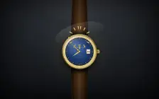
Draw a mechanical wristwatch that shows the current local time, with a sweeping seconds hand and a date window. Make it look expensive.

It must be one complete, self-contained HTML file: inline all CSS and JavaScript, and make no network requests of any kind (no CDNs, web fonts or remote images). Reply with the file in a single ```html code block.
Source
13 kB 228 lines Raw
<!DOCTYPE html>
<html lang="en">
<head>
<meta charset="utf-8">
<meta name="viewport" content="width=device-width, initial-scale=1">
<title>AURELIUS · Or Bleu</title>
<style>
*{box-sizing:border-box;margin:0;padding:0;-webkit-tap-highlight-color:transparent}
html,body{height:100%}
body{
background:radial-gradient(1200px 820px at 50% 14%, #34383f 0%, #1d2025 48%, #0a0c0f 100%);
display:flex;align-items:center;justify-content:center;overflow:hidden;
font-family:Georgia,'Times New Roman',serif;user-select:none;
}
body::before{content:'';position:fixed;inset:0;background:radial-gradient(720px 320px at 50% -4%, rgba(255,244,214,.09), transparent 70%);pointer-events:none}
body::after{content:'';position:fixed;inset:0;box-shadow:inset 0 0 240px rgba(0,0,0,.8);pointer-events:none}
#wrap{position:relative}
#stage{position:absolute;left:0;top:0;width:460px;height:900px;transform-origin:0 0}
.halo{position:absolute;left:50%;top:470px;width:660px;height:660px;margin:-330px 0 0 -330px;border-radius:50%;
background:radial-gradient(circle, rgba(212,175,55,.16), rgba(212,175,55,.05) 42%, transparent 66%)}
/* ---------- strap ---------- */
.strap{position:absolute;left:150px;width:160px;z-index:1;
background:
repeating-linear-gradient(115deg, rgba(0,0,0,.12) 0 2px, transparent 2px 7px),
repeating-linear-gradient(65deg, rgba(255,255,255,.035) 0 2px, transparent 2px 9px),
linear-gradient(90deg,#1a0d04,#3a2210 22%,#5d3c1f 50%,#3a2210 78%,#160a03);
box-shadow:inset 0 0 22px rgba(0,0,0,.55), inset 8px 0 14px rgba(0,0,0,.4), inset -8px 0 14px rgba(0,0,0,.4)}
.strap::before,.strap::after{content:'';position:absolute;top:10px;bottom:10px;border-left:2px dashed rgba(232,214,170,.5)}
.strap::before{left:11px}.strap::after{right:11px}
.strap.top{top:-70px;height:382px;clip-path:polygon(8% 0,92% 0,100% 100%,0 100%);
box-shadow:inset 0 0 22px rgba(0,0,0,.55), inset 8px 0 14px rgba(0,0,0,.4), inset -8px 0 14px rgba(0,0,0,.4), inset 0 -46px 34px -18px rgba(0,0,0,.6)}
.strap.bot{top:628px;height:340px;clip-path:polygon(0 0,100% 0,92% 100%,8% 100%);
box-shadow:inset 0 0 22px rgba(0,0,0,.55), inset 8px 0 14px rgba(0,0,0,.4), inset -8px 0 14px rgba(0,0,0,.4), inset 0 46px 34px -18px rgba(0,0,0,.6)}
/* ---------- lugs & crown ---------- */
.lw{position:absolute;left:50%;top:470px;width:0;height:0;z-index:2}
.lug{position:absolute;left:-15px;top:-148px;width:30px;height:100px;border-radius:9px;
background:linear-gradient(90deg,#4a360b,#a87f24 28%,#f9ecb8 50%,#caa64b 72%,#3d2c08);
box-shadow:inset 0 2px 2px rgba(255,255,255,.55), inset 0 -4px 5px rgba(0,0,0,.45), 0 5px 9px rgba(0,0,0,.45)}
.crown{position:absolute;z-index:3;left:calc(50% + 150px);top:470px;width:36px;height:38px;transform:translateY(-50%);
background:repeating-linear-gradient(0deg,#e8cf8a 0 3px,#8a6a1f 3px 5px);border-radius:7px;
box-shadow:inset 0 2px 3px rgba(255,255,255,.6), inset 0 -3px 4px rgba(0,0,0,.45), 0 3px 7px rgba(0,0,0,.5)}
.crown::before{content:'';position:absolute;left:-16px;top:50%;width:18px;height:20px;transform:translateY(-50%);
background:linear-gradient(90deg,#6e5213,#e8cf8a 50%,#8a6a1f);border-radius:3px}
.crown::after{content:'';position:absolute;right:-5px;top:4px;bottom:4px;width:9px;border-radius:4px;
background:linear-gradient(90deg,#fdf3c0,#a87f24);box-shadow:inset 0 0 3px rgba(0,0,0,.4)}
/* ---------- case & fluted bezel ---------- */
.case{position:absolute;left:50%;top:470px;width:332px;height:332px;margin:-166px 0 0 -166px;border-radius:50%;z-index:4;
background:linear-gradient(150deg,#f7e6ae 0%,#d9b45c 16%,#8a6a1f 36%,#5c430f 52%,#a87f24 66%,#e8cf8a 84%,#8a6a1f 100%);
box-shadow:0 30px 60px rgba(0,0,0,.6), 0 8px 18px rgba(0,0,0,.5), inset 0 3px 4px rgba(255,255,255,.55), inset 0 -6px 10px rgba(0,0,0,.5)}
.case::after{content:'';position:absolute;inset:0;border-radius:50%;box-shadow:inset 0 0 0 1px rgba(30,20,2,.5)}
.bezel{position:absolute;inset:8px;border-radius:50%;
background:
radial-gradient(circle at 33% 27%, rgba(255,255,255,.5), rgba(255,255,255,0) 46%),
repeating-conic-gradient(from 0deg,#f9e9b0 0deg 2.4deg,#a87f24 2.4deg 3deg,#e8cf8a 3deg 5.4deg,#7a5a16 5.4deg 6deg);
box-shadow:inset 0 4px 8px rgba(0,0,0,.5), inset 0 -4px 8px rgba(255,255,255,.28), 0 1px 2px rgba(0,0,0,.4)}
.bezel::after{content:'';position:absolute;inset:0;border-radius:50%;
box-shadow:inset 0 0 0 1px rgba(255,246,210,.5), inset 0 0 0 3px rgba(60,40,5,.35)}
/* ---------- dial ---------- */
.dial{position:absolute;left:50%;top:50%;width:268px;height:268px;margin:-134px 0 0 -134px;border-radius:50%;z-index:5;
background:
radial-gradient(circle at 34% 26%, rgba(130,165,235,.30), rgba(130,165,235,0) 44%),
repeating-conic-gradient(from 0deg, rgba(255,255,255,.05) 0deg .5deg, rgba(2,6,18,.09) .5deg 1deg),
radial-gradient(circle at 50% 46%, #2b5299 0%, #1b3a72 42%, #0e2148 74%, #081430 100%)}
.dial::after{content:'';position:absolute;inset:0;border-radius:50%;z-index:3;pointer-events:none;
box-shadow:inset 0 0 0 1px rgba(240,220,150,.35), inset 0 0 0 3px rgba(0,0,0,.35), inset 0 0 30px rgba(0,0,0,.6)}
.rail{position:absolute;left:50%;top:50%;border-radius:50%;border:1px solid rgba(233,207,138,.22);z-index:1}
.rail.a{width:262px;height:262px;margin:-131px 0 0 -131px}
.rail.b{width:238px;height:238px;margin:-119px 0 0 -119px}
#ticks{position:absolute;inset:0;z-index:2}
.tk{position:absolute;inset:0}
.tk i{position:absolute;left:calc(50% - 1px);top:6px;width:2px;height:9px;background:rgba(226,199,124,.7);border-radius:1px}
.tk.tk5 i{top:4px;left:calc(50% - 1.5px);width:3px;height:14px;background:rgba(246,230,174,.95)}
#indices{position:absolute;inset:0;z-index:6}
.idx{position:absolute;left:50%;top:calc(50% - 107px);width:12px;height:30px;margin-left:-6px;
clip-path:polygon(0 0,100% 0,77% 100%,23% 100%);
background:
linear-gradient(180deg, rgba(255,255,255,.4), rgba(255,255,255,0) 30%, rgba(0,0,0,0) 70%, rgba(0,0,0,.35)),
linear-gradient(90deg,#4a360b,#a87f24 22%,#f6e6ae 46%,#fff8d8 50%,#f0d47a 54%,#a87f24 78%,#3d2c08);
filter:drop-shadow(0 2px 2px rgba(0,0,0,.55))}
.txt{position:absolute;left:0;right:0;text-align:center;color:#ecd48e;z-index:4;
text-shadow:0 1px 1px rgba(0,0,0,.65), 0 0 10px rgba(212,175,55,.25)}
.logo{top:62px;left:50%;right:auto;margin-left:-11px;width:22px;height:18px;
background:linear-gradient(180deg,#fdf3c0,#caa64b 60%,#8a6a1f);
clip-path:polygon(0 100%,0 55%,25% 20%,38% 55%,50% 8%,62% 55%,75% 20%,100% 55%,100% 100%);
filter:drop-shadow(0 1px 1px rgba(0,0,0,.5))}
.brand{top:86px;font-size:16px;letter-spacing:5px;text-indent:5px}
.geneve{top:108px;font-size:7.5px;letter-spacing:4px;text-indent:4px;color:#d9bd76}
.auto{top:164px;font-size:8px;letter-spacing:3.5px;text-indent:3.5px}
.chrono{top:180px;font-size:6.5px;letter-spacing:2.5px;text-indent:2.5px;color:#d9bd76}
.swiss{top:244px;font-size:6px;letter-spacing:2px;text-indent:2px;color:#cbb26a}
.datewin{position:absolute;z-index:5;left:calc(50% + 84px);top:50%;transform:translate(-50%,-50%);
width:36px;height:44px;padding:3px;border-radius:4px;
background:linear-gradient(145deg,#f9ecb8,#caa64b 40%,#6e5213 75%,#a87f24);
box-shadow:0 1px 3px rgba(0,0,0,.65), inset 0 1px 1px rgba(255,255,255,.6), inset 0 -1px 2px rgba(0,0,0,.4)}
.datewin .disc{width:100%;height:100%;border-radius:2px;background:linear-gradient(180deg,#fdfcf6,#ece7d6);
box-shadow:inset 0 1px 3px rgba(0,0,0,.4), inset 0 -1px 1px rgba(255,255,255,.8);
display:flex;align-items:center;justify-content:center;
font-family:Arial,Helvetica,sans-serif;font-weight:700;font-size:20px;color:#191919}
/* ---------- hands ---------- */
.hand{position:absolute;left:50%;bottom:50%;transform-origin:50% 100%}
.hand .b{position:absolute;left:50%;bottom:0;transform:translateX(-50%);
clip-path:polygon(50% 0,86% 100%,14% 100%);
background:
linear-gradient(180deg, rgba(255,255,255,.3), rgba(255,255,255,0) 30%, rgba(0,0,0,0) 72%, rgba(0,0,0,.3)),
linear-gradient(90deg,#5c430f,#a87f24 28%,#f6e6ae 46%,#fff8d8 50%,#f0d47a 54%,#caa64b 74%,#4a360b)}
.hand.hour{z-index:7;filter:drop-shadow(0 3px 3px rgba(0,0,0,.5))}
.hand.hour .b{width:24px;height:80px}
.hand.min{z-index:8;filter:drop-shadow(0 3px 3px rgba(0,0,0,.5))}
.hand.min .b{width:17px;height:116px}
.hand.sec{z-index:9;filter:drop-shadow(0 2px 2px rgba(0,0,0,.45))}
.sec .nd{position:absolute;left:calc(50% - 1.5px);top:0;width:3px;height:126px;border-radius:2px 2px 0 0;
background:linear-gradient(90deg,#6e5213,#e8cf8a 45%,#fff8d8 50%,#caa64b 60%,#5c430f)}
.sec .tl{position:absolute;left:calc(50% - 1.5px);top:100%;width:3px;height:26px;
background:linear-gradient(90deg,#6e5213,#caa64b 50%,#5c430f)}
.sec .cw{position:absolute;left:50%;top:calc(100% + 18px);width:14px;height:14px;margin-left:-7px;border-radius:50%;
background:radial-gradient(circle at 35% 30%, #fff8d8, #d4af37 45%, #6e5213 90%);
box-shadow:0 1px 2px rgba(0,0,0,.5)}
.cap{position:absolute;z-index:10;left:50%;top:50%;width:17px;height:17px;margin:-8.5px 0 0 -8.5px;border-radius:50%;
background:radial-gradient(circle at 36% 30%, #fff8d8, #e8cf8a 30%, #a87f24 65%, #4a360b);
box-shadow:0 1px 3px rgba(0,0,0,.6), inset 0 -1px 2px rgba(0,0,0,.45)}
/* ---------- crystal & sparkle ---------- */
.crystal{position:absolute;inset:8px;border-radius:50%;z-index:30;pointer-events:none;
background:radial-gradient(circle at 30% 20%, rgba(255,255,255,.17), rgba(255,255,255,.05) 20%, rgba(255,255,255,0) 42%)}
.crystal::after{content:'';position:absolute;left:-25%;top:-35%;width:150%;height:60%;transform:rotate(-16deg);
background:linear-gradient(180deg, rgba(255,255,255,.12), rgba(255,255,255,0) 80%);border-radius:50%;filter:blur(1px)}
.glint{position:absolute;z-index:40;left:336px;top:364px;width:44px;height:44px;margin:-22px 0 0 -22px;
background-image:
radial-gradient(circle, rgba(255,255,255,.95) 0 1.5px, rgba(255,255,255,.35) 2.5px, transparent 5px),
linear-gradient(90deg, transparent, rgba(255,255,255,.9) 50%, transparent),
linear-gradient(0deg, transparent, rgba(255,255,255,.9) 50%, transparent);
background-size:100% 100%,100% 2px,2px 100%;background-position:center;background-repeat:no-repeat;
animation:tw 7s ease-in-out infinite}
@keyframes tw{0%,100%{opacity:.2;transform:scale(.8) rotate(0deg)}50%{opacity:.85;transform:scale(1.15) rotate(10deg)}}
@media (prefers-reduced-motion: reduce){.glint{animation:none}}
</style>
</head>
<body>
<div id="wrap">
<div id="stage">
<div class="halo"></div>
<div class="strap top"></div>
<div class="strap bot"></div>
<div class="lw" style="transform:rotate(-22deg)"><div class="lug"></div></div>
<div class="lw" style="transform:rotate(22deg)"><div class="lug"></div></div>
<div class="lw" style="transform:rotate(158deg)"><div class="lug"></div></div>
<div class="lw" style="transform:rotate(202deg)"><div class="lug"></div></div>
<div class="crown"></div>
<div class="case">
<div class="bezel"></div>
<div class="dial" id="dial">
<div class="rail a"></div><div class="rail b"></div>
<div id="ticks"></div>
<div class="txt logo"></div>
<div class="txt brand">AURELIUS</div>
<div class="txt geneve">GENÈVE</div>
<div class="txt auto">AUTOMATIC</div>
<div class="txt chrono">CHRONOMÈTRE</div>
<div class="txt swiss">SWISS MADE</div>
<div class="datewin"><div class="disc" id="dnum">8</div></div>
<div id="indices"></div>
<div class="hand hour" id="hh"><div class="b"></div></div>
<div class="hand min" id="mh"><div class="b"></div></div>
<div class="hand sec" id="sh"><div class="nd"></div><div class="tl"></div><div class="cw"></div></div>
<div class="cap"></div>
</div>
<div class="crystal"></div>
</div>
<div class="glint"></div>
</div>
</div>
<script>
(function(){
var ticks=document.getElementById('ticks');
for(var i=0;i<60;i++){
var w=document.createElement('div');
w.className='tk'+(i%5===0?' tk5':'');
w.style.transform='rotate('+(i*6)+'deg)';
w.innerHTML='<i></i>';
ticks.appendChild(w);
}
var idx=document.getElementById('indices');
[-6.5,6.5,30,60,120,150,180,210,240,270,300,330].forEach(function(a){
var w=document.createElement('div');
w.className='iw';
w.style.transform='rotate('+a+'deg)';
w.innerHTML='<div class="idx"></div>';
idx.appendChild(w);
});
var hH=document.getElementById('hh'), mH=document.getElementById('mh'),
sH=document.getElementById('sh'), dN=document.getElementById('dnum');
var lastDate=-1;
function frame(){
var d=new Date();
var s=d.getSeconds()+d.getMilliseconds()/1000;
var m=d.getMinutes()+s/60;
var h=(d.getHours()%12)+m/60;
sH.style.transform='rotate('+(s*6)+'deg)';
mH.style.transform='rotate('+(m*6)+'deg)';
hH.style.transform='rotate('+(h*30)+'deg)';
var dt=d.getDate();
if(dt!==lastDate){ dN.textContent=dt; lastDate=dt; }
requestAnimationFrame(frame);
}
requestAnimationFrame(frame);
var stage=document.getElementById('stage'), wrap=document.getElementById('wrap');
function fit(){
var s=Math.min(window.innerWidth/500, window.innerHeight/940, 1.35);
wrap.style.width=(460*s)+'px';
wrap.style.height=(900*s)+'px';
stage.style.transform='scale('+s+')';
}
window.addEventListener('resize',fit);
fit();
})();
</script>
</body>
</html>Compare with
Ling 3.2 Flash: other attempts

- Ling 3.2 Flash, Breakout: Not run yet

- 148words