Run details
- Model
- meta/muse-spark-open
- Route
- OpenRouter API, one user message
- Reasoning
- provider default, 2,772 reasoning tokens
- Limits
- 60 min · 141,176 output tokens
- Date
- 21 Oct 2026
- Time
- 43 s
- Size
- 25 kB
- Tokens
- 220 in, 12,058 out
- List price
- $0.052 ($1.25 in / $4.25 out per M)
- Paid
- $0.051
Exact prompt
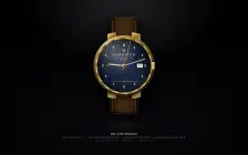
Draw a mechanical wristwatch that shows the current local time, with a sweeping seconds hand and a date window. Make it look expensive.

It must be one complete, self-contained HTML file: inline all CSS and JavaScript, and make no network requests of any kind (no CDNs, web fonts or remote images). Reply with the file in a single ```html code block.
Source
25 kB 867 lines Raw
<!DOCTYPE html>
<html lang="en">
<head>
<meta charset="UTF-8">
<meta name="viewport" content="width=device-width, initial-scale=1.0">
<title>AURELIUS — Haute Horlogerie</title>
<style>
  *{margin:0;padding:0;box-sizing:border-box}
  body{
    min-height:100vh;
    display:grid;
    place-items:center;
    background:
      radial-gradient(ellipse 900px 700px at 50% -10%, #2a2a30 0%, transparent 60%),
      radial-gradient(ellipse 1200px 900px at 50% 120%, #0a0a0f 0%, #050508 55%, #000000 100%),
      #0b0b0e;
    font-family: Georgia, "Times New Roman", serif;
    overflow:hidden;
    color:#e8e0c8;
  }
  /* ambient vignette */
  body::before{
    content:"";
    position:fixed;
    inset:0;
    background: radial-gradient(ellipse at center, transparent 58%, rgba(0,0,0,0.55) 100%);
    pointer-events:none;
  }
  .scene{
    position:relative;
    display:flex;
    flex-direction:column;
    align-items:center;
    justify-content:center;
    padding:30px 0 10px;
  }
  .reflection{
    width:320px;
    height:70px;
    margin-top:18px;
    background: radial-gradient(ellipse at center, rgba(255,255,255,0.08) 0%, rgba(255,255,255,0.03) 35%, transparent 70%);
    filter:blur(6px);
    border-radius:50%;
    opacity:0.9;
  }
  .label{
    margin-top:6px;
    text-align:center;
    letter-spacing:0.32em;
    font-size:10px;
    color:rgba(232,224,200,0.45);
    text-transform:uppercase;
  }
  .label strong{
    display:block;
    letter-spacing:0.05em;
    font-size:13px;
    color:rgba(255,248,220,0.9);
    font-weight:400;
    margin-bottom:6px;
    text-transform:none;
    font-style:italic;
  }

  /* WATCH */
  .watch{
    position:relative;
    width:360px;
    height:500px;
    display:flex;
    flex-direction:column;
    align-items:center;
    filter: drop-shadow(0 30px 40px rgba(0,0,0,0.85)) drop-shadow(0 8px 12px rgba(0,0,0,0.6));
  }

  /* STRAPS */
  .strap{
    position:absolute;
    left:50%;
    width:148px;
    height:168px;
    transform:translateX(-50%);
    background:
      linear-gradient(90deg, #0e0702 0%, #1f1207 7%, #2b1a0c 15%, #3d2614 30%, #432c18 50%, #3d2614 70%, #2b1a0c 85%, #1f1207 93%, #0e0702 100%),
      repeating-linear-gradient(90deg, transparent 0 2px, rgba(0,0,0,0.15) 2px 3px);
    box-shadow:
      inset 0 1px 0 rgba(255,220,160,0.18),
      inset 0 -6px 18px rgba(0,0,0,0.9),
      0 4px 10px rgba(0,0,0,0.5);
    z-index:1;
  }
  .strap-top{
    top:0;
    border-radius:18px 18px 6px 6px;
    border-top:1px solid #6b4a2a;
    border-left:1px solid #3a2614;
    border-right:1px solid #3a2614;
  }
  .strap-bottom{
    bottom:0;
    border-radius:6px 6px 18px 18px;
    border-bottom:1px solid #6b4a2a;
    border-left:1px solid #3a2614;
    border-right:1px solid #3a2614;
  }
  /* stitching */
  .strap::before, .strap::after{
    content:"";
    position:absolute;
    top:10px;
    bottom:10px;
    width:2px;
    background: repeating-linear-gradient(to bottom, #c9a86a 0 6px, transparent 6px 10px);
    opacity:0.95;
    box-shadow: 0 0 1px rgba(0,0,0,0.8);
  }
  .strap::before{left:10px}
  .strap::after{right:10px}
  .strap-top::before,.strap-top::after{ top:18px; bottom:8px;}
  .strap-bottom::before,.strap-bottom::after{ top:8px; bottom:18px;}
  /* strap keepers */
  .keeper{
    position:absolute;
    left:50%;
    transform:translateX(-50%);
    width:156px;
    height:22px;
    background: linear-gradient(to bottom, #2a1b0e, #1a0f06 60%, #0f0a04);
    border:1px solid #4a3420;
    border-radius:4px;
    box-shadow: inset 0 1px 0 rgba(255,210,140,0.2), 0 2px 6px rgba(0,0,0,0.6);
    z-index:2;
  }
  .keeper.top{ top:116px; }
  .keeper.bottom{ bottom:116px; }

  /* LUGS */
  .lugs{
    position:absolute;
    left:50%;
    top:50%;
    width:184px;
    height:336px;
    transform:translate(-50%,-50%);
    z-index:2;
    pointer-events:none;
  }
  .lug{
    position:absolute;
    width:46px;
    height:62px;
    background: linear-gradient(145deg, #f9e7b0 0%, #d4a848 18%, #8c6a2a 45%, #f0d78a 70%, #a67c1e 100%);
    box-shadow: inset 0 1px 1px rgba(255,255,255,0.9), inset 0 -2px 4px rgba(80,50,10,0.6), 0 4px 10px rgba(0,0,0,0.5);
  }
  .lug.tl{ top:0; left:6px; border-radius:8px 6px 4px 12px; transform:skewY(-10deg) }
  .lug.tr{ top:0; right:6px; border-radius:6px 8px 12px 4px; transform:skewY(10deg) }
  .lug.bl{ bottom:0; left:6px; border-radius:12px 4px 6px 8px; transform:skewY(10deg) }
  .lug.br{ bottom:0; right:6px; border-radius:4px 12px 8px 6px; transform:skewY(-10deg) }

  /* CASE */
  .case-wrap{
    position:absolute;
    left:50%;
    top:50%;
    transform:translate(-50%,-50%);
    width:312px;
    height:312px;
    border-radius:50%;
    z-index:5;
    display:grid;
    place-items:center;
    background:
      radial-gradient(circle at 30% 20%, #fff8d0 0%, #f9e7b0 8%, #d4a848 22%, #8c6a2a 45%, #5a4215 70%, #2f220c 100%);
    box-shadow:
      0 0 0 1px #3d2e0f,
      0 1px 2px rgba(255,255,255,0.6) inset,
      0 -8px 20px rgba(0,0,0,0.7) inset,
      0 18px 30px rgba(0,0,0,0.55),
      0 4px 10px rgba(0,0,0,0.5);
    padding:10px;
  }
  /* fluted bezel */
  .bezel{
    width:100%;
    height:100%;
    border-radius:50%;
    padding:7px;
    background:
      conic-gradient(from 0deg,
        #7a5a1a 0deg, #f9e7b0 7deg, #d4a848 14deg, #7a5a1a 21deg,
        #f9e7b0 28deg, #d4a848 35deg, #7a5a1a 42deg,
        #f9e7b0 49deg, #d4a848 56deg, #7a5a1a 63deg,
        #f9e7b0 70deg, #d4a848 77deg, #7a5a1a 84deg,
        #f9e7b0 91deg, #d4a848 98deg, #7a5a1a 105deg,
        #f9e7b0 112deg, #d4a848 119deg, #7a5a1a 126deg,
        #f9e7b0 133deg, #d4a848 140deg, #7a5a1a 147deg,
        #f9e7b0 154deg, #d4a848 161deg, #7a5a1a 168deg,
        #f9e7b0 175deg, #d4a848 182deg, #7a5a1a 189deg,
        #f9e7b0 196deg, #d4a848 203deg, #7a5a1a 210deg,
        #f9e7b0 217deg, #d4a848 224deg, #7a5a1a 231deg,
        #f9e7b0 238deg, #d4a848 245deg, #7a5a1a 252deg,
        #f9e7b0 259deg, #d4a848 266deg, #7a5a1a 273deg,
        #f9e7b0 280deg, #d4a848 287deg, #7a5a1a 294deg,
        #f9e7b0 301deg, #d4a848 308deg, #7a5a1a 315deg,
        #f9e7b0 322deg, #d4a848 329deg, #7a5a1a 336deg,
        #f9e7b0 343deg, #d4a848 350deg, #7a5a1a 360deg
      );
    box-shadow: inset 0 2px 6px rgba(0,0,0,0.5), inset 0 -2px 6px rgba(255,255,255,0.35);
    position:relative;
  }
  .bezel::after{
    content:"";
    position:absolute;
    inset:7px;
    border-radius:50%;
    box-shadow: inset 0 3px 10px rgba(0,0,0,0.8), inset 0 -1px 2px rgba(255,255,255,0.6);
    pointer-events:none;
  }
  /* crown */
  .crown{
    position:absolute;
    right:-14px;
    top:50%;
    transform:translateY(-50%);
    width:22px;
    height:38px;
    background: linear-gradient(90deg, #5a4215 0%, #d4a848 20%, #f9e7b0 45%, #d4a848 75%, #7a5a1a 100%);
    border-radius:4px;
    box-shadow: inset 0 1px 1px rgba(255,255,255,0.8), 0 2px 6px rgba(0,0,0,0.6);
    z-index:10;
    display:flex;
    align-items:center;
    justify-content:center;
  }
  .crown::before{
    content:"";
    width:100%;
    height:100%;
    background: repeating-linear-gradient(to bottom, transparent 0 4px, rgba(0,0,0,0.28) 4px 6px);
    border-radius:4px;
  }
  .crown-logo{
    position:absolute;
    font-size:8px;
    color:#3d2e0f;
    text-shadow:0 1px 0 rgba(255,255,255,0.6);
  }

  /* DIAL */
  .dial{
    width:100%;
    height:100%;
    border-radius:50%;
    position:relative;
    overflow:hidden;
    background:
      radial-gradient(ellipse at 30% 28%, rgba(255,255,255,0.18) 0%, transparent 45%),
      radial-gradient(circle at 50% 50%, #1e2e52 0%, #152040 22%, #0d1a33 48%, #0a1326 72%, #070e1e 100%);
    box-shadow: inset 0 0 30px rgba(0,0,0,0.9), inset 0 0 70px rgba(0,0,0,0.6), inset 0 1px 1px rgba(255,255,255,0.18);
  }
  /* sunburst */
  .dial::before{
    content:"";
    position:absolute;
    inset:-30%;
    background: conic-gradient(from 0deg at 50% 50%,
      transparent 0deg, rgba(255,255,255,0.035) 8deg, transparent 16deg,
      rgba(255,255,255,0.03) 24deg, transparent 32deg,
      rgba(255,255,255,0.035) 40deg, transparent 48deg,
      rgba(255,255,255,0.02) 56deg, transparent 64deg,
      rgba(255,255,255,0.03) 72deg, transparent 80deg,
      rgba(255,255,255,0.035) 88deg, transparent 96deg,
      rgba(255,255,255,0.02) 104deg, transparent 112deg,
      rgba(255,255,255,0.03) 120deg, transparent 128deg,
      rgba(255,255,255,0.035) 136deg, transparent 144deg,
      rgba(255,255,255,0.02) 152deg, transparent 160deg,
      rgba(255,255,255,0.03) 168deg, transparent 176deg,
      rgba(255,255,255,0.035) 184deg, transparent 192deg,
      rgba(255,255,255,0.02) 200deg, transparent 208deg,
      rgba(255,255,255,0.03) 216deg, transparent 224deg,
      rgba(255,255,255,0.035) 232deg, transparent 240deg,
      rgba(255,255,255,0.02) 248deg, transparent 256deg,
      rgba(255,255,255,0.03) 264deg, transparent 272deg,
      rgba(255,255,255,0.035) 280deg, transparent 288deg,
      rgba(255,255,255,0.02) 296deg, transparent 304deg,
      rgba(255,255,255,0.03) 312deg, transparent 320deg,
      rgba(255,255,255,0.035) 328deg, transparent 336deg,
      rgba(255,255,255,0.02) 344deg, transparent 352deg
    );
    opacity:0.9;
    pointer-events:none;
  }
  /* minute track */
  .track{
    position:absolute;
    inset:10px;
    border-radius:50%;
    border:1px solid rgba(212,168,72,0.22);
    box-shadow: inset 0 0 0 1px rgba(255,255,255,0.04);
    pointer-events:none;
  }
  .track-ticks{
    position:absolute;
    inset:0;
    border-radius:50%;
  }
  .tick{
    position:absolute;
    left:50%;
    top:50%;
    width:1px;
    height:6px;
    background:rgba(232,224,200,0.38);
    transform-origin:center -124px;
    margin-left:-0.5px;
    margin-top:-124px;
  }
  .tick.major{
    width:1.5px;
    height:10px;
    background:rgba(249,231,176,0.85);
  }
  /* brand */
  .brand{
    position:absolute;
    left:50%;
    top:56px;
    transform:translateX(-50%);
    text-align:center;
    z-index:4;
    width:140px;
  }
  .brand-crown{
    font-size:13px;
    line-height:1;
    color:#f9e7b0;
    text-shadow:0 1px 2px rgba(0,0,0,0.8), 0 0 10px rgba(249,231,176,0.45);
    margin-bottom:4px;
  }
  .brand-name{
    font-size:16px;
    letter-spacing:0.28em;
    font-weight:400;
    color:#f5e6b8;
    text-shadow:0 1px 3px rgba(0,0,0,0.8);
  }
  .brand-sub{
    font-size:7.5px;
    letter-spacing:0.32em;
    color:rgba(245,230,184,0.72);
    margin-top:3px;
    font-family: Arial, Helvetica, sans-serif;
  }
  .swiss{
    position:absolute;
    left:50%;
    bottom:54px;
    transform:translateX(-50%);
    font-size:6.5px;
    letter-spacing:0.28em;
    color:rgba(245,230,184,0.62);
    font-family: Arial, Helvetica, sans-serif;
    z-index:4;
    white-space:nowrap;
  }

  /* hour markers */
  .markers{
    position:absolute;
    inset:0;
    z-index:3;
  }
  .marker{
    position:absolute;
    left:50%;
    top:50%;
    transform-origin:center;
    display:flex;
    align-items:flex-start;
    justify-content:center;
  }
  .marker-i{
    background: linear-gradient(to bottom, #fff8d0 0%, #f9e7b0 30%, #d4a848 70%, #8c6a2a 100%);
    box-shadow: 0 1px 3px rgba(0,0,0,0.6), 0 0 6px rgba(249,231,176,0.25);
    border-radius:1px;
    position:relative;
  }
  .marker-i::after{
    content:"";
    position:absolute;
    left:1px;
    top:1px;
    right:1px;
    height:40%;
    background: linear-gradient(to bottom, rgba(255,255,255,0.9), transparent);
    border-radius:1px;
  }
  /* Triangle at 12 */
  .marker.t12 .marker-i{
    width:10px;
    height:18px;
    clip-path: polygon(50% 0%, 0% 100%, 100% 100%);
    background: linear-gradient(to bottom, #fff8d0, #f9e7b0 40%, #d4a848);
  }
  .marker.t3 .marker-i, .marker.t9 .marker-i{
    width:14px;
    height:5px;
    border-radius:2px;
  }
  .marker.t6 .marker-i{
    width:5px;
    height:14px;
    border-radius:2px;
  }
  .marker.hour .marker-i{
    width:4px;
    height:12px;
    border-radius:1.5px;
  }
  /* diamond markers for luxury */
  .marker.diamond .marker-i{
    width:7px;
    height:7px;
    transform:rotate(45deg);
    background: radial-gradient(circle at 30% 30%, #ffffff 0%, #f9e7b0 25%, #d4a848 60%, #8c6a2a 100%);
    box-shadow: 0 1px 4px rgba(0,0,0,0.6), 0 0 8px rgba(255,255,255,0.35);
    border-radius:0;
  }

  /* date window */
  .date-wrap{
    position:absolute;
    right:42px;
    top:50%;
    transform:translateY(-50%);
    width:30px;
    height:20px;
    background: linear-gradient(to bottom, #fdfaf0 0%, #f0e6c8 100%);
    border:1.5px solid #c9a848;
    border-radius:2px;
    box-shadow:
      inset 0 1px 3px rgba(0,0,0,0.35),
      inset 0 -1px 1px rgba(255,255,255,0.9),
      0 1px 2px rgba(0,0,0,0.5),
      0 0 0 1px rgba(60,40,10,0.9);
    display:grid;
    place-items:center;
    z-index:4;
    overflow:hidden;
  }
  .date-wrap::before{
    content:"";
    position:absolute;
    inset:0;
    background: linear-gradient(105deg, transparent 40%, rgba(255,255,255,0.55) 50%, transparent 60%);
    pointer-events:none;
  }
  #date{
    font-family: Arial, Helvetica, sans-serif;
    font-size:12px;
    font-weight:700;
    color:#0a0a0a;
    letter-spacing:-0.02em;
    line-height:1;
    text-shadow:0 0.5px 0 rgba(255,255,255,0.8);
  }
  .date-bevel{
    position:absolute;
    inset:-3px;
    border:1px solid rgba(201,168,72,0.9);
    border-radius:3px;
    box-shadow: inset 0 1px 0 rgba(255,255,255,0.7);
    pointer-events:none;
  }
  /* cyclops magnifier effect - subtle stretch */
  .cyclops{
    position:absolute;
    right:38px;
    top:50%;
    transform:translateY(-50%);
    width:38px;
    height:30px;
    border-radius:6px;
    background: radial-gradient(ellipse at 50% 30%, rgba(255,255,255,0.12) 0%, rgba(255,255,255,0.05) 40%, transparent 75%);
    border:1px solid rgba(255,255,255,0.07);
    pointer-events:none;
    z-index:12;
    backdrop-filter: blur(0.3px);
  }

  /* hands */
  .hands{
    position:absolute;
    inset:0;
    z-index:6;
  }
  .hand{
    position:absolute;
    left:50%;
    bottom:50%;
    transform-origin:50% 100%;
    border-radius: 999px;
    will-change: transform;
  }
  .hour-hand{
    width:10px;
    height:84px;
    margin-left:-5px;
    background: linear-gradient(90deg, #7a5a1a 0%, #f9e7b0 35%, #fff8d0 50%, #d4a848 75%, #7a5a1a 100%);
    box-shadow: 0 0 8px rgba(0,0,0,0.5), 0 1px 2px rgba(0,0,0,0.7);
    clip-path: polygon(50% 0%, 82% 14%, 78% 100%, 22% 100%, 18% 14%);
    z-index:3;
  }
  .hour-hand::after{
    content:"";
    position:absolute;
    left:50%;
    top:14px;
    width:2px;
    height:50px;
    transform:translateX(-50%);
    background: rgba(255,255,255,0.32);
    border-radius:1px;
  }
  .minute-hand{
    width:7px;
    height:118px;
    margin-left:-3.5px;
    background: linear-gradient(90deg, #7a5a1a 0%, #f9e7b0 35%, #fff8d0 50%, #d4a848 75%, #7a5a1a 100%);
    box-shadow: 0 0 8px rgba(0,0,0,0.45), 0 1px 3px rgba(0,0,0,0.7);
    clip-path: polygon(50% 0%, 80% 10%, 72% 100%, 28% 100%, 20% 10%);
    z-index:4;
  }
  .minute-hand::after{
    content:"";
    position:absolute;
    left:50%;
    top:10px;
    width:1.5px;
    height:78px;
    transform:translateX(-50%);
    background: rgba(255,255,255,0.32);
    border-radius:1px;
  }
  .second-hand{
    width:2px;
    height:132px;
    margin-left:-1px;
    z-index:5;
    background: transparent;
    overflow:visible;
  }
  .second-stem{
    position:absolute;
    left:50%;
    bottom:0;
    width:2px;
    height:132px;
    transform:translateX(-50%);
    background: linear-gradient(to bottom, #d98a2e 0%, #ffb84d 45%, #e63922 85%, #8a1a0f 100%);
    box-shadow: 0 0 4px rgba(230,60,20,0.55);
    border-radius:1px;
  }
  .second-tail{
    position:absolute;
    left:50%;
    bottom:-18px;
    width:9px;
    height:9px;
    transform:translateX(-50%);
    background: radial-gradient(circle at 30% 30%, #ffd89e 0%, #ffb84d 30%, #d98a2e 65%, #7a3d0a 100%);
    border:1px solid #5a2d08;
    border-radius:50%;
    box-shadow: 0 1px 3px rgba(0,0,0,0.6);
  }
  .second-tip{
    position:absolute;
    left:50%;
    top:0;
    width:7px;
    height:12px;
    transform:translateX(-50%);
    background: #e63922;
    clip-path: polygon(50% 0%, 100% 60%, 50% 100%, 0% 60%);
    box-shadow:0 1px 2px rgba(0,0,0,0.5);
  }
  .second-counter{
    position:absolute;
    left:50%;
    bottom:-28px;
    width:2px;
    height:28px;
    transform:translateX(-50%);
    background: linear-gradient(to bottom, #ffb84d, #7a3d0a);
    border-radius:1px;
  }

  /* center */
  .center{
    position:absolute;
    left:50%;
    top:50%;
    width:22px;
    height:22px;
    transform:translate(-50%,-50%);
    border-radius:50%;
    background: radial-gradient(circle at 30% 25%, #fff8d0 0%, #f9e7b0 20%, #d4a848 48%, #8c6a2a 75%, #5a4215 100%);
    border:1px solid #3d2e0f;
    box-shadow: 0 2px 6px rgba(0,0,0,0.6), inset 0 1px 1px rgba(255,255,255,0.85);
    z-index:8;
    display:grid;
    place-items:center;
  }
  .center::after{
    content:"";
    width:7px;
    height:7px;
    border-radius:50%;
    background: radial-gradient(circle at 30% 30%, #2a1b0a, #000);
    border:1px solid #4a3520;
    box-shadow: inset 0 1px 1px rgba(255,255,255,0.35);
  }
  /* sapphire crystal */
  .crystal{
    position:absolute;
    inset:2px;
    border-radius:50%;
    background:
      radial-gradient(ellipse 420px 220px at 18% 12%, rgba(255,255,255,0.24) 0%, rgba(255,255,255,0.10) 18%, transparent 42%),
      radial-gradient(ellipse 260px 160px at 82% 86%, rgba(255,255,255,0.06) 0%, transparent 60%);
    pointer-events:none;
    z-index:9;
    box-shadow: inset 0 1px 1px rgba(255,255,255,0.45), inset 0 -1px 2px rgba(0,0,0,0.25);
  }
  .crystal::after{
    content:"";
    position:absolute;
    inset:0;
    border-radius:50%;
    border:1px solid rgba(255,255,255,0.10);
  }

  /* rehaut */
  .rehaut{
    position:absolute;
    inset:0;
    border-radius:50%;
    border:1px solid rgba(212,168,72,0.14);
    box-shadow: inset 0 0 18px rgba(0,0,0,0.9);
    pointer-events:none;
    z-index:2;
  }

  @media (max-width:480px){
    .watch{ transform:scale(0.92); }
  }
</style>
</head>
<body>
<div class="scene">
  <div class="watch" aria-label="Luxury mechanical wristwatch showing local time">
    <!-- straps -->
    <div class="strap strap-top"></div>
    <div class="strap strap-bottom"></div>
    <div class="keeper top"></div>
    <div class="keeper bottom"></div>

    <!-- lugs -->
    <div class="lugs">
      <div class="lug tl"></div><div class="lug tr"></div>
      <div class="lug bl"></div><div class="lug br"></div>
    </div>

    <!-- case -->
    <div class="case-wrap">
      <div class="bezel">
        <div class="crown"><span class="crown-logo">♛</span></div>
        <div class="dial" id="dial">
          <div class="track"></div>
          <div class="track-ticks" id="ticks"></div>

          <div class="brand">
            <div class="brand-crown">♛</div>
            <div class="brand-name">AURELIUS</div>
            <div class="brand-sub">AUTOMATIC · 28 JEWELS</div>
          </div>
          <div class="swiss">SWISS MADE · CHRONOMETER</div>

          <div class="markers" id="markers">
            <!-- markers positioned via JS for precision, fallback static -->
          </div>

          <div class="date-wrap"><span id="date">01</span><div class="date-bevel"></div></div>
          <div class="cyclops"></div>

          <div class="hands">
            <div class="hand hour-hand" id="hour"></div>
            <div class="hand minute-hand" id="minute"></div>
            <div class="hand second-hand" id="second">
              <div class="second-stem"></div>
              <div class="second-tip"></div>
              <div class="second-tail"></div>
              <div class="second-counter"></div>
            </div>
            <div class="center"></div>
          </div>

          <div class="rehaut"></div>
          <div class="crystal"></div>
        </div>
      </div>
    </div>
  </div>

  <div class="reflection"></div>
  <div class="label">
    <strong>Ref. 5172G Perpetual</strong>
    Calibre AR-01 · 72H Power Reserve · Sapphire Crystal · Alligator Leather
    <span style="display:block;margin-top:6px;font-size:9px;opacity:0.5;letter-spacing:0.18em">Sweeping seconds · Instant date · Local time</span>
  </div>
</div>

<script>
(function(){
  const dial = document.getElementById('dial');
  const ticksEl = document.getElementById('ticks');
  const markersEl = document.getElementById('markers');
  const hourEl = document.getElementById('hour');
  const minuteEl = document.getElementById('minute');
  const secondEl = document.getElementById('second');
  const dateEl = document.getElementById('date');

  // build minute ticks (60)
  for(let i=0;i<60;i++){
    const tick = document.createElement('div');
    tick.className = 'tick' + (i%5===0 ? ' major' : '');
    tick.style.transform = `rotate(${i*6}deg)`;
    ticksEl.appendChild(tick);
  }

  // build markers
  const markerData = [
    {h:0, type:'t12', angle:0},
    {h:1, type:'diamond', angle:30},
    {h:2, type:'diamond', angle:60},
    {h:3, type:'t3', angle:90},
    {h:4, type:'diamond', angle:120},
    {h:5, type:'hour', angle:150},
    {h:6, type:'t6', angle:180},
    {h:7, type:'hour', angle:210},
    {h:8, type:'diamond', angle:240},
    {h:9, type:'t9', angle:270},
    {h:10, type:'diamond', angle:300},
    {h:11, type:'hour', angle:330},
  ];
  const radius = 108;
  markerData.forEach(m=>{
    const wrap = document.createElement('div');
    wrap.className = 'marker ' + m.type;
    // position around circle
    const rad = (m.angle-90) * Math.PI/180;
    const x = Math.cos(rad) * radius;
    const y = Math.sin(rad) * radius;
    wrap.style.left = '50%';
    wrap.style.top = '50%';
    wrap.style.transform = `translate(-50%,-50%) translate(${x}px, ${y}px) rotate(${m.angle}deg)`;
    const inner = document.createElement('div');
    inner.className = 'marker-i';
    wrap.appendChild(inner);
    markersEl.appendChild(wrap);
  });

  // optional: inner gold ring with numerals III VI IX faint
  const romanLayer = document.createElement('div');
  romanLayer.style.cssText = 'position:absolute;inset:0;z-index:2;pointer-events:none;';
  const romans = [
    {t:'XII', a:0, r:82},
    {t:'III', a:90, r:84},
    {t:'VI', a:180, r:82},
    {t:'IX', a:270, r:84},
  ];
  romans.forEach(r=>{
    const el = document.createElement('div');
    el.textContent = r.t;
    el.style.position='absolute';
    el.style.left='50%';
    el.style.top='50%';
    el.style.fontSize='10px';
    el.style.letterSpacing='0.14em';
    el.style.color='rgba(249,231,176,0.92)';
    el.style.textShadow='0 1px 2px rgba(0,0,0,0.8)';
    el.style.fontFamily='Georgia, serif';
    const rad=(r.a-90)*Math.PI/180;
    const x=Math.cos(rad)*r.r;
    const y=Math.sin(rad)*r.r;
    el.style.transform=`translate(-50%,-50%) translate(${x}px,${y}px)`;
    el.style.opacity='0.95';
    romanLayer.appendChild(el);
  });
  dial.appendChild(romanLayer);

  // subtle guilloche center
  const guilloche = document.createElement('div');
  guilloche.style.cssText = 'position:absolute;left:50%;top:50%;width:196px;height:196px;transform:translate(-50%,-50%);border-radius:50%;opacity:0.10;background:repeating-radial-gradient(circle at center, transparent 0 3px, rgba(249,231,176,0.9) 3px 3.5px);mask:radial-gradient(circle, black 68%, transparent 71%);-webkit-mask:radial-gradient(circle, black 68%, transparent 71%);pointer-events:none;z-index:2;';
  dial.appendChild(guilloche);

  // small seconds sub-pattern - sunken centre
  const centreShade = document.createElement('div');
  centreShade.style.cssText = 'position:absolute;left:50%;top:50%;width:154px;height:154px;transform:translate(-50%,-50%);border-radius:50%;background:radial-gradient(circle at 35% 30%, rgba(255,255,255,0.07) 0%, transparent 55%), radial-gradient(circle at 50% 50%, transparent 62%, rgba(0,0,0,0.45) 100%);border:1px solid rgba(212,168,72,0.12);pointer-events:none;z-index:2;box-shadow:inset 0 1px 6px rgba(0,0,0,0.5);';
  dial.appendChild(centreShade);

  function update(){
    const now = new Date();
    const ms = now.getMilliseconds();
    const s = now.getSeconds() + ms/1000;
    const m = now.getMinutes() + s/60;
    const h = (now.getHours() % 12) + m/60;

    const sDeg = s * 6;        // 360/60
    const mDeg = m * 6;
    const hDeg = h * 30;       // 360/12

    // sweeping seconds - continuous
    secondEl.style.transform = `rotate(${sDeg}deg)`;
    minuteEl.style.transform = `rotate(${mDeg}deg)`;
    hourEl.style.transform = `rotate(${hDeg}deg)`;

    dateEl.textContent = String(now.getDate()).padStart(2,'0');

    requestAnimationFrame(update);
  }

  // slight parallax for crystal highlight
  dial.addEventListener('mousemove', (e)=>{
    const rect = dial.getBoundingClientRect();
    const x = (e.clientX - rect.left)/rect.width - 0.5;
    const y = (e.clientY - rect.top)/rect.height - 0.5;
    dial.style.setProperty('--mx', x);
    dial.style.setProperty('--my', y);
    const crystal = dial.querySelector('.crystal');
    crystal.style.background = `
      radial-gradient(ellipse 420px 220px at ${18 + x*28}% ${12 + y*22}%, rgba(255,255,255,0.28) 0%, rgba(255,255,255,0.11) 18%, transparent 42%),
      radial-gradient(ellipse 260px 160px at ${82 + x*10}% ${86 + y*10}%, rgba(255,255,255,0.07) 0%, transparent 60%)
    `;
  });

  // micro mechanical tremor on seconds - imperceptible but adds life
  let lastT = performance.now();
  function tremor(){
    const t = performance.now();
    const dt = t - lastT;
    lastT = t;
    // tiny jitter proportional to seconds motion for mechanical feel
    const jitter = Math.sin(t*0.022) * 0.06;
    secondEl.style.marginLeft = (-1 + jitter) + 'px';
    requestAnimationFrame(tremor);
  }

  update();
  requestAnimationFrame(tremor);

  // handle visibility change - resync
  document.addEventListener('visibilitychange', ()=>{ if(!document.hidden) update(); });
})();
</script>
</body>
</html>