Run details
- Model
- xingchen-agi/xing4.0-29b-a4b:free
- Route
- OpenRouter API, one user message
- Reasoning
- provider default, 26,867 reasoning tokens
- Limits
- 60 min · 235,929 output tokens
- Date
- 21 Oct 2026
- Time
- 7 min 41 s
- Size
- 7.3 kB
- Tokens
- 84 in, 30,187 out
- List price
- free (list price $0)
- Paid
- $0 (free route)
Exact prompt
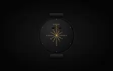
Draw a mechanical wristwatch that shows the current local time, with a sweeping seconds hand and a date window. Make it look expensive.

It must be one complete, self-contained HTML file: inline all CSS and JavaScript, and make no network requests of any kind (no CDNs, web fonts or remote images). Reply with the file in a single ```html code block.
Source
7.3 kB 313 lines Raw
<!DOCTYPE html>
<html lang="en">
<head>
<meta charset="UTF-8">
<meta viewport="width=device-width, initial-scale=1.0">
<title>AURINE — Mechanical Watch</title>
<style>
* { margin: 0; padding: 0; box-sizing: border-box; }

body {
  min-height: 100vh;
  display: flex;
  align-items: center;
  justify-content: center;
  background: #050505;
  background-image: radial-gradient(ellipse at 50% 50%, #1a1a1a 0%, #050505 75%);
  font-family: 'Helvetica Neue', Arial, sans-serif;
  padding: 24px;
}

.watch {
  width: 480px;
  height: 480px;
  position: relative;
}

/* --- Lug connectors --- */
.lugs-top,
.lugs-bottom {
  position: absolute;
  left: 50%;
  transform: translateX(-50%);
  width: 150px;
  height: 38px;
  background: linear-gradient(to bottom, #2c2c2c, #0a0a0a);
  border-radius: 6px;
  box-shadow:
    0 8px 20px rgba(0,0,0,.85),
    inset 0 1px 0 rgba(255,255,255,.08);
  z-index: 2;
}
.lugs-top { top: -10px; }
.lugs-bottom { bottom: -10px; }

/* --- Crystal --- */
.crystal {
  position: absolute;
  left: 50%;
  top: 50%;
  transform: translate(-50%, -50%);
  width: 400px;
  height: 400px;
  border-radius: 50%;
  background:
    radial-gradient(circle at 32% 22%, rgba(255,255,255,.08), transparent 55%),
    linear-gradient(135deg, #1a1a1c, #080808);
  box-shadow:
    inset 0 0 50px rgba(0,0,0,.95),
    inset 2px 0 8px rgba(255,255,255,.03),
    inset -2px 0 8px rgba(0,0,0,.5),
    0 0 0 2px #080808,
    0 0 0 10px #1c1c1c,
    0 0 0 12px #0a0a0a;
  padding: 10px;
  z-index: 1;
}

/* --- Dial --- */
.dial {
  position: relative;
  width: 100%;
  height: 100%;
  border-radius: 50%;
  background:
    repeating-radial-gradient(circle at 50% 50%, transparent 0, transparent 2px, rgba(0,0,0,.06) 3px, transparent 4px),
    radial-gradient(circle at 35% 28%, #2c2c2e, #101012 72%);
  overflow: hidden;
}

/* --- Brand --- */
.brand {
  position: absolute;
  top: 58px;
  left: 50%;
  transform: translateX(-50%);
  color: #d4af37;
  font-size: 11px;
  font-weight: 600;
  letter-spacing: 5px;
  text-transform: uppercase;
  text-shadow:
    0 1px 0 rgba(0,0,0,.9),
    0 -1px 0 rgba(255,255,255,.06);
}

/* --- Date window --- */
.date-window {
  position: absolute;
  top: 96px;
  left: 50%;
  transform: translateX(-50%);
  width: 110px;
  height: 22px;
  background: rgba(0,0,0,.65);
  border: 1px solid #4a4028;
  border-radius: 2px;
  display: flex;
  align-items: center;
  justify-content: center;
  color: #d4af37;
  font-size: 10px;
  font-weight: 600;
  letter-spacing: 3px;
  font-variant-numeric: tabular-nums;
  box-shadow: inset 0 1px 3px rgba(0,0,0,.6);
}

/* --- Markers --- */
.marker {
  position: absolute;
  left: 50%;
  top: 50%;
  width: 3px;
  height: 62px;
  background: linear-gradient(to bottom, #e8c869, #a8862a);
  transform-origin: 50% 100%;
  transform: translate(-50%, -100%) rotate(var(--a));
}
.marker.long { height: 100px; }

.num {
  position: absolute;
  left: 50%;
  top: -17px;
  transform: translateX(-50%);
  color: #d4af37;
  font-size: 10px;
  font-weight: 700;
  letter-spacing: .5px;
  line-height: 1;
}

/* --- Hands --- */
.hand {
  position: absolute;
  left: 50%;
  top: 50%;
  transform-origin: 50% 100%;
  transform: translate(-50%, -100%);
  z-index: 4;
}
.hour-hand {
  width: 6px;
  height: 58px;
  background: linear-gradient(to right, #0c0c0c, #3a3a3a 45%, #0c0c0c);
  border-radius: 3px;
}
.minute-hand {
  width: 4px;
  height: 82px;
  background: linear-gradient(to right, #0c0c0c, #3a3a3a 45%, #0c0c0c);
  border-radius: 2px;
}
.second-hand {
  width: 2px;
  height: 102px;
  background: linear-gradient(to right, #d32f2f, #8a1f1f);
  border-radius: 1px;
  z-index: 5;
  transform-origin: 50% 100%;
  transform: translate(-50%, -100%) rotate(0deg);
  animation: sweep 60s linear infinite;
}
.second-hand::after {
  content: '';
  position: absolute;
  left: 50%;
  top: 88%;
  transform: translateX(-50%);
  width: 11px;
  height: 11px;
  background: radial-gradient(circle at 35% 30%, #e57373, #5a1010);
  border-radius: 50%;
}
@keyframes sweep {
  from { transform: translate(-50%, -100%) rotate(0deg); }
  to   { transform: translate(-50%, -100%) rotate(360deg); }
}

/* --- Crown --- */
.crown {
  position: absolute;
  right: 30px;
  top: 50%;
  width: 14px;
  height: 40px;
  background: linear-gradient(to bottom, #2a2a2a, #080808);
  border-radius: 4px;
  transform: translateY(-50%);
  z-index: 3;
  box-shadow: 0 2px 4px rgba(0,0,0,.6);
}
.crown::after {
  content: '';
  position: absolute;
  left: 50%;
  top: 5px;
  transform: translateX(-50%);
  width: 22px;
  height: 7px;
  background: #0a0a0a;
  border-radius: 1px;
}

/* --- Center cap --- */
.center-cap {
  position: absolute;
  left: 50%;
  top: 50%;
  width: 16px;
  height: 16px;
  margin: -8px 0 0 -8px;
  background: radial-gradient(circle at 35% 30%, #e8c869, #9a7d2a 70%);
  border-radius: 50%;
  z-index: 6;
  box-shadow:
    inset 0 1px 2px rgba(255,255,255,.35),
    0 1px 2px rgba(0,0,0,.6);
}

/* --- Screws --- */
.screw {
  position: absolute;
  width: 7px;
  height: 7px;
  background: radial-gradient(circle at 35% 30%, #d4af37, #6a5218);
  border-radius: 50%;
  z-index: 7;
  box-shadow: inset 0 -1px 1px rgba(0,0,0,.5);
}

@media (max-width: 540px) {
  .watch { transform: scale(.62); transform-origin: center; }
}
</style>
</head>
<body>
<div class="watch">
  <div class="lugs-top"></div>
  <div class="crystal">
    <div class="dial" id="dial">
      <span class="brand">AURINE</span>
      <div class="date-window"><span id="dateText">----</span></div>
      <div class="markers" id="markers"></div>
      <div class="hand hour-hand" id="hourHand"></div>
      <div class="hand minute-hand" id="minuteHand"></div>
      <div class="hand second-hand" id="secondHand"></div>
      <div class="crown"></div>
      <div class="center-cap"></div>
    </div>
  </div>
  <div class="lugs-bottom"></div>
</div>
<script>
(function () {
  // Build 12 roman-numeral markers
  var roman = ['XII','I','II','III','IV','V','VI','VII','VIII','IX','X','XI'];
  var markers = document.getElementById('markers');
  roman.forEach(function (num, i) {
    var m = document.createElement('div');
    m.className = 'marker' + (['III','VI','IX','XII'].indexOf(num) !== -1 ? ' long' : '');
    m.style.setProperty('--a', (i * 30) + 'deg');
    var n = document.createElement('span');
    n.className = 'num';
    n.textContent = num;
    m.appendChild(n);
    markers.appendChild(m);
  });

  // Build 6 screws around the rim
  var dial = document.getElementById('dial');
  for (var i = 0; i < 6; i++) {
    var angle = i * 60;
    var rad = angle * Math.PI / 180;
    var x = 190 + 182 * Math.sin(rad);
    var y = 190 - 182 * Math.cos(rad);
    var s = document.createElement('div');
    s.className = 'screw';
    s.style.left = x + 'px';
    s.style.top = y + 'px';
    s.style.transform = 'translate(-50%, -50%)';
    dial.appendChild(s);
  }

  // Live clock
  function tick() {
    var now = new Date();
    var h = now.getHours();
    var m = now.getMinutes();
    var s = now.getSeconds();
    document.getElementById('hourHand').style.transform =
      'translate(-50%, -100%) rotate(' + (h * 30 + m * 0.5 + s * 0.005) + 'deg)';
    document.getElementById('minuteHand').style.transform =
      'translate(-50%, -100%) rotate(' + (m * 6 + s * 0.1) + 'deg)';
    document.getElementById('dateText').textContent =
      now.getDate() + '/' + (now.getMonth() + 1);
    requestAnimationFrame(tick);
  }
  requestAnimationFrame(tick);
})();
</script>
</body>
</html>