Run details
- Model
- meta/muse-wonder
- Route
- OpenRouter API, one user message
- Served by
- Meta
- Effort
- medium, OpenRouter's default for this model
- Limits
- 60 min · 30,000 output tokens (our $0.60 limit per run at $20/M)
- Date
- 23 Oct 2026
- Time
- 83 s
- Size
- 15 kB
- Tokens
- 84 in, 7,489 out (2,257 of them thinking)
- List price
- $0.15 at today's price ($4 in / $20 out per M)
- Paid
- $0.15
Exact prompt
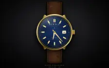
Draw a mechanical wristwatch that shows the current local time, with a sweeping seconds hand and a date window. Make it look expensive.

It must be one complete, self-contained HTML file: inline all CSS and JavaScript, and make no network requests of any kind (no CDNs, web fonts or remote images). Reply with the file in a single ```html code block.
Source
15 kB 292 lines Raw
<!DOCTYPE html>
<html lang="en">
<head>
<meta charset="UTF-8">
<meta name="viewport" content="width=device-width, initial-scale=1.0">
<title>AURELE — Mechanical Timepiece</title>
<style>
  * { margin:0; padding:0; box-sizing:border-box; }
  html,body { height:100%; }
  body {
    min-height:100vh;
    display:flex; align-items:center; justify-content:center;
    background:
      radial-gradient(ellipse 900px 600px at 50% 38%, #2b2b30 0%, #161618 48%, #080809 100%);
    font-family: Georgia, "Times New Roman", serif;
    overflow:hidden;
    color:#d8c690;
  }
  body::before{
    content:""; position:fixed; inset:0; pointer-events:none;
    background:radial-gradient(ellipse at 50% 45%, transparent 45%, rgba(0,0,0,.72) 100%);
  }
  .scene{ position:relative; display:flex; flex-direction:column; align-items:center; padding:10px 0 4px; }
  .watch{
    position:relative;
    width:min(88vw, 430px);
    height:min(92vh, 790px);
    filter: drop-shadow(0 42px 38px rgba(0,0,0,.72));
  }
  /* ---------- STRAP ---------- */
  .strap{
    position:absolute; left:50%; transform:translateX(-50%);
    width:46%; height:49%; z-index:1; overflow:hidden;
    background:
      radial-gradient(ellipse 34px 18px at 28% 18%, rgba(255,255,255,.10), transparent 60%),
      radial-gradient(ellipse 46px 22px at 72% 34%, rgba(0,0,0,.34), transparent 62%),
      radial-gradient(ellipse 38px 20px at 35% 58%, rgba(255,255,255,.07), transparent 60%),
      radial-gradient(ellipse 48px 24px at 70% 78%, rgba(0,0,0,.36), transparent 62%),
      repeating-linear-gradient(93deg, transparent 0 34px, rgba(0,0,0,.22) 35px, transparent 37px),
      repeating-linear-gradient(4deg, transparent 0 27px, rgba(0,0,0,.20) 28px, transparent 30px),
      linear-gradient(90deg,#160d08,#3a2113 14%,#4b2c18 50%,#38200f 86%,#120a06);
    box-shadow: inset 14px 0 22px rgba(0,0,0,.65), inset -14px 0 22px rgba(0,0,0,.65), inset 0 0 45px rgba(0,0,0,.55);
  }
  .strap.top{ top:0; border-radius:22px 22px 8px 8px; }
  .strap.bottom{ bottom:0; border-radius:8px 8px 26px 26px; }
  .strap::before,.strap::after{
    content:""; position:absolute; top:14px; bottom:14px; width:0;
    border-left:2px dashed rgba(232,211,165,.72);
    filter:drop-shadow(0 1px 1px rgba(0,0,0,.8));
  }
  .strap::before{ left:13px; } .strap::after{ right:13px; }
  .holes{ position:absolute; left:50%; top:56px; transform:translateX(-50%); display:flex; flex-direction:column; gap:27px; }
  .holes i{ width:11px; height:11px; border-radius:50%; background:#080403; box-shadow: inset 0 2px 3px #000, 0 1px 0 rgba(255,235,190,.28); display:block; }
  .keeper{
    position:absolute; left:7%; right:7%; top:104px; height:30px;
    border:2px solid rgba(20,11,6,.9); border-radius:5px;
    background:linear-gradient(180deg, rgba(255,255,255,.09), transparent 45%, rgba(0,0,0,.35));
    box-shadow:0 3px 8px rgba(0,0,0,.5), inset 0 0 8px rgba(0,0,0,.5);
  }
  /* ---------- LUGS & CROWN ---------- */
  .lug{ position:absolute; width:38px; height:74px; z-index:2;
    background:linear-gradient(90deg,#6e5118,#d9b95c 38%,#fff0ae 52%,#a37f27 82%,#5f4513);
    border-radius:8px; box-shadow:0 5px 10px rgba(0,0,0,.55), inset 0 0 7px rgba(80,55,0,.55); }
  .lug.tl{ left:18%; top:22.5%; transform:rotate(24deg); }
  .lug.tr{ right:18%; top:22.5%; transform:rotate(-24deg); }
  .lug.bl{ left:18%; bottom:22.5%; transform:rotate(-24deg); }
  .lug.br{ right:18%; bottom:22.5%; transform:rotate(24deg); }
  .crown{
    position:absolute; z-index:3; right:-27px; top:50%; transform:translateY(-50%);
    width:30px; height:52px; border-radius:7px;
    background:
      repeating-linear-gradient(90deg,#7c5c15 0 3px,#f4dc8b 3px 5px,#9a7420 5px 8px),
      linear-gradient(#c9a63f,#8a671c);
    box-shadow:4px 4px 10px rgba(0,0,0,.65), inset 0 3px 5px rgba(255,255,255,.45), inset 0 -4px 6px rgba(0,0,0,.45);
  }
  .crown::before{ content:"✦"; position:absolute; inset:0; display:grid; place-items:center; color:rgba(70,48,0,.75); font-size:13px; text-shadow:0 1px 0 rgba(255,255,255,.5); }
  .crown-stem{ position:absolute; z-index:2; right:-9px; top:50%; transform:translateY(-50%); width:12px; height:20px; background:linear-gradient(#e9cd76,#8b671c); }
  /* ---------- CASE ---------- */
  .case{
    position:absolute; z-index:4; left:50%; top:50%; transform:translate(-50%,-50%);
    width:min(88vw,424px); aspect-ratio:1; border-radius:50%; padding:13px;
    background:conic-gradient(from 210deg,#5e4510,#c9a63f 10%,#fff3b0 18%,#8f6d1d 29%,#f8e58f 42%,#6f5314 55%,#e7c65f 68%,#fff6bd 78%,#967325 90%,#5e4510);
    box-shadow:
      0 22px 45px rgba(0,0,0,.75),
      inset 0 3px 8px rgba(255,255,255,.75),
      inset 0 -8px 16px rgba(60,40,0,.65),
      0 0 0 2px #2e2107;
  }
  .bezel{
    width:100%; height:100%; border-radius:50%; padding:9px;
    background:conic-gradient(from 35deg,#111,#3c3c40,#050505,#55565a,#101012,#2c2c30,#050505,#4a4b4f,#111);
    box-shadow: inset 0 2px 6px rgba(255,255,255,.35), inset 0 -4px 8px #000, 0 1px 3px rgba(255,240,180,.55);
  }
  .dial-wrap{
    position:relative; width:100%; height:100%; border-radius:50%; overflow:hidden;
    background:
      repeating-radial-gradient(circle at 50% 50%, rgba(255,255,255,.025) 0 1px, transparent 1px 5px),
      conic-gradient(from 0deg,#071226,#16305e 8%,#08152f 17%,#1a386e 26%,#071226 36%,#132c58 47%,#050f22 58%,#18376f 69%,#071226 80%,#122b55 91%,#071226),
      radial-gradient(circle,#132d5c,#050d1e 72%);
    box-shadow: inset 0 0 0 2px rgba(230,198,105,.75), inset 0 0 42px rgba(0,0,0,.88), inset 0 0 8px #000;
  }
  .dial-wrap::before{
    content:""; position:absolute; inset:6.5%; border-radius:50%; z-index:1;
    border:1px solid rgba(216,190,115,.23);
    background:repeating-radial-gradient(circle, transparent 0 3px, rgba(255,255,255,.018) 3px 4px);
    pointer-events:none;
  }
  svg{ position:absolute; inset:0; width:100%; height:100%; z-index:2; }
  .glass{
    position:absolute; inset:0; z-index:8; border-radius:50%; pointer-events:none;
    background:
      linear-gradient(128deg, rgba(255,255,255,.24) 0%, rgba(255,255,255,.06) 24%, transparent 43%),
      radial-gradient(ellipse 62% 34% at 31% 13%, rgba(255,255,255,.20), transparent 65%),
      radial-gradient(circle at 76% 84%, rgba(150,190,255,.07), transparent 42%);
    box-shadow: inset 0 0 22px rgba(255,255,255,.05), inset 0 -12px 24px rgba(0,0,0,.24);
  }
  .caption{ margin-top:14px; text-align:center; z-index:5; }
  .caption .name{ font-size:13px; letter-spacing:.48em; text-indent:.48em; color:#cdb674; text-shadow:0 2px 8px #000; }
  .caption .time{ margin-top:7px; font-family:"Courier New",monospace; font-size:12px; letter-spacing:.28em; text-indent:.28em; color:rgba(238,225,190,.62); }
  @media (max-height:700px){ .caption{display:none;} .watch{height:96vh;} }
</style>
</head>
<body>
  <main class="scene" aria-label="Luxury mechanical wristwatch showing the current local time">
    <div class="watch">
      <div class="strap top"></div>
      <div class="strap bottom"><div class="keeper"></div><div class="holes"><i></i><i></i><i></i><i></i><i></i></div></div>

      <div class="lug tl"></div><div class="lug tr"></div><div class="lug bl"></div><div class="lug br"></div>

      <div class="case">
        <div class="crown-stem"></div><div class="crown"></div>
        <div class="bezel">
          <div class="dial-wrap">
            <svg viewBox="0 0 400 400" role="img" aria-label="Watch dial">
              <defs>
                <linearGradient id="gold" x1="0" y1="0" x2="1" y2="1">
                  <stop offset="0" stop-color="#8a671d"/><stop offset=".28" stop-color="#f7e391"/>
                  <stop offset=".52" stop-color="#b78f2e"/><stop offset=".75" stop-color="#fff2b2"/>
                  <stop offset="1" stop-color="#7c5b14"/>
                </linearGradient>
                <linearGradient id="goldDark" x1="0" y1="0" x2="0" y2="1">
                  <stop offset="0" stop-color="#ffefa8"/><stop offset=".5" stop-color="#c49a36"/><stop offset="1" stop-color="#6f5312"/>
                </linearGradient>
                <radialGradient id="centre" cx="50%" cy="42%" r="65%">
                  <stop offset="0" stop-color="#1d3d76"/><stop offset=".55" stop-color="#0c1e42"/><stop offset="1" stop-color="#03091a"/>
                </radialGradient>
              </defs>

              <circle cx="200" cy="200" r="191" fill="url(#centre)" opacity=".72"/>
              <circle cx="200" cy="200" r="181" fill="none" stroke="#d9bd6d" stroke-width="1" opacity=".5"/>
              <circle cx="200" cy="200" r="151" fill="none" stroke="#ffffff" stroke-width=".6" opacity=".10"/>

              <g id="minuteTrack"></g>
              <g id="hourIndices"></g>

              <!-- Brand -->
              <text x="200" y="112" text-anchor="middle" font-family="Georgia, 'Times New Roman', serif"
                    font-size="25" letter-spacing="6" fill="#ecd99b">AURELE</text>
              <text x="200" y="133" text-anchor="middle" font-family="Georgia, serif"
                    font-size="9.5" letter-spacing="5" fill="#cbbd91">GENÈVE</text>
              <text x="200" y="154" text-anchor="middle" font-size="15" fill="#e8cf7f">♛</text>

              <text x="200" y="270" text-anchor="middle" font-family="Georgia, serif"
                    font-size="10" letter-spacing="3.5" fill="#d8c995">AUTOMATIC</text>
              <text x="200" y="288" text-anchor="middle" font-family="Georgia, serif"
                    font-size="8" letter-spacing="2.8" fill="#aebbd2">CHRONOMETER · 28 800 A/h</text>
              <text x="200" y="365" text-anchor="middle" font-family="Georgia, serif"
                    font-size="7.5" letter-spacing="3" fill="#c9b77e">SWISS MADE</text>

              <!-- Date window at 3 o'clock -->
              <g>
                <rect x="294" y="179" width="51" height="42" rx="4" fill="#0a0a0a"/>
                <rect x="297" y="182" width="45" height="36" rx="3" fill="#f4ecd8" stroke="url(#gold)" stroke-width="2.5"/>
                <rect x="300" y="185" width="39" height="30" rx="2" fill="none" stroke="rgba(0,0,0,.16)"/>
                <text id="dateNum" x="320" y="210" text-anchor="middle"
                      font-family="Georgia, 'Times New Roman', serif" font-size="25" font-weight="bold" fill="#151515">1</text>
              </g>

              <!-- Hands -->
              <g id="hourHand">
                <polygon points="200,207 191,200 196,122 200,105 204,122 209,200" fill="url(#gold)" stroke="#fff0a8" stroke-width=".8"/>
                <polygon points="200,196 196,190 198,132 200,122 202,132 204,190" fill="#f7f3df" opacity=".92"/>
              </g>
              <g id="minuteHand">
                <polygon points="200,208 192,200 197,82 200,62 203,82 208,200" fill="url(#gold)" stroke="#fff0a8" stroke-width=".8"/>
                <polygon points="200,196 197,188 199,92 200,78 201,92 203,188" fill="#f7f3df" opacity=".92"/>
              </g>
              <g id="secondHand">
                <line x1="200" y1="242" x2="200" y2="58" stroke="#e9bd55" stroke-width="2.4"/>
                <line x1="200" y1="242" x2="200" y2="58" stroke="#fff0ad" stroke-width=".7"/>
                <circle cx="200" cy="82" r="6" fill="none" stroke="#e9bd55" stroke-width="3"/>
                <polygon points="200,42 195,62 205,62" fill="#e9bd55"/>
                <circle cx="200" cy="226" r="8" fill="url(#goldDark)" stroke="#ffe99b" stroke-width="1"/>
              </g>
              <circle cx="200" cy="200" r="10" fill="url(#goldDark)" stroke="#ffefa6" stroke-width="1.4"/>
              <circle cx="200" cy="200" r="3.2" fill="#1a1203"/>
            </svg>
            <div class="glass"></div>
          </div>
        </div>
      </div>
    </div>
    <div class="caption">
      <div class="name">HAUTE HORLOGERIE</div>
      <div class="time" id="digital">--:--:--</div>
    </div>
  </main>

<script>
(function () {
  var NS = "http://www.w3.org/2000/svg";
  var track = document.getElementById("minuteTrack");
  var indices = document.getElementById("hourIndices");

  function el(name, attrs, parent) {
    var n = document.createElementNS(NS, name);
    for (var k in attrs) n.setAttribute(k, attrs[k]);
    parent.appendChild(n);
    return n;
  }

  // Minute / seconds track
  for (var i = 0; i < 60; i++) {
    var hour = i % 5 === 0;
    var line = el("line", {
      x1: 200, y1: 17, x2: 200, y2: hour ? 31 : 25,
      stroke: hour ? "#ecd28a" : "#c8d2e6", "stroke-width": hour ? 2.2 : 1, opacity: hour ? .95 : .55
    }, track);
    line.setAttribute("transform", "rotate(" + (i * 6) + " 200 200)");
  }
  // Small Arabic numerals inside the minute track
  [12,2,4,6,8,10].forEach(function(num){
    var a = (num % 12) * 30 * Math.PI / 180;
    var t = el("text", {
      x: 200 + Math.sin(a) * 158, y: 200 - Math.cos(a) * 158 + 4,
      "text-anchor":"middle", "font-family":"Georgia, serif", "font-size":"10", fill:"#d7c48a", opacity:".8"
    }, track);
    t.textContent = num;
  });

  // Applied polished-gold baton indices (double baton at 12, date replaces 3)
  for (var h = 0; h < 12; h++) {
    if (h === 3) continue;
    var g = el("g", {}, indices);
    g.setAttribute("transform", "rotate(" + (h * 30) + " 200 200)");
    if (h === 0) {
      el("rect", {x:188, y:38, width:9, height:39, rx:2, fill:"url(#gold)", stroke:"#fff3b0", "stroke-width":.8}, g);
      el("rect", {x:203, y:38, width:9, height:39, rx:2, fill:"url(#gold)", stroke:"#fff3b0", "stroke-width":.8}, g);
      el("rect", {x:191, y:43, width:3, height:28, fill:"#fffbe9", opacity:.85}, g);
      el("rect", {x:206, y:43, width:3, height:28, fill:"#fffbe9", opacity:.85}, g);
    } else {
      el("rect", {x:193, y:38, width:14, height:39, rx:2.5, fill:"url(#gold)", stroke:"#fff3b0", "stroke-width":.8}, g);
      el("rect", {x:197, y:43, width:4, height:28, fill:"#fffbe9", opacity:.88}, g);
    }
  }

  var hourHand = document.getElementById("hourHand");
  var minuteHand = document.getElementById("minuteHand");
  var secondHand = document.getElementById("secondHand");
  var dateNum = document.getElementById("dateNum");
  var digital = document.getElementById("digital");
  var lastDate = -1;

  function pad(n){ return (n < 10 ? "0" : "") + n; }

  function update() {
    var now = new Date();
    var ms = now.getMilliseconds();
    // True sweeping motion: continuous angle from milliseconds,
    // animated with requestAnimationFrame (mechanical, no ticking step).
    var seconds = now.getSeconds() + ms / 1000;
    var minutes = now.getMinutes() + seconds / 60;
    var hours = (now.getHours() % 12) + minutes / 60;

    secondHand.setAttribute("transform", "rotate(" + (seconds * 6) + " 200 200)");
    minuteHand.setAttribute("transform", "rotate(" + (minutes * 6) + " 200 200)");
    hourHand.setAttribute("transform", "rotate(" + (hours * 30) + " 200 200)");

    if (now.getDate() !== lastDate) {
      lastDate = now.getDate();
      dateNum.textContent = lastDate;
    }
    digital.textContent = pad(now.getHours()) + ":" + pad(now.getMinutes()) + ":" + pad(now.getSeconds()) + "  ·  " + lastDate;

    requestAnimationFrame(update);
  }
  requestAnimationFrame(update);
})();
</script>
</body>
</html>