Run details
- Model
- prism-ml/ternary-bonsai-2-9b
- Route
- OpenRouter API, one user message
- Served by
- Darkbloom
- Effort
- the model's default
- Limits
- 60 min · 65,536 output tokens (the model's limit)
- Date
- 1 Nov 2026
- Time
- 1 min 40 s
- Size
- 20 kB
- Tokens
- 99 in, 6,784 out (1,063 of them thinking)
- List price
- <$0.001 at today's price ($0.08 in / $0.13 out per M)
- Paid
- <$0.001
Exact prompt
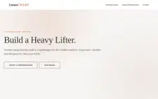
Build the landing page for Lumen Cycles, a Copenhagen workshop that builds custom cargo bikes to order. Make it look like a real brand you would trust with 4,000 euros.

It must be one complete, self-contained HTML file: inline all CSS and JavaScript, and make no network requests of any kind (no CDNs, web fonts or remote images). Reply with the file in a single ```html code block.
Source
20 kB 557 lines Raw
<!DOCTYPE html>
<html lang="en">
<head>
<meta charset="UTF-8">
<meta name="viewport" content="width=device-width, initial-scale=1.0">
<title>Lumen Cycles | Copenhagen Craftsmanship</title>
<style>
/* --- CSS VARIABLES & RESET --- */
:root {
--bg-color: #F7F6F4; /* Warm, paper-like off-white */
--text-color: #222222;
--text-light: #666666;
--accent-color: #C05B30; /* Rust / Terra Cotta */
--accent-dark: #8E3828;
--nav-bg: #FFFFFF;
--border-color: #E0E0E0;
--header-height: 80px;
--container-width: 1200px;
--shadow: 0 10px 30px rgba(0,0,0,0.05);
--font-sans: 'Helvetica Neue', Helvetica, Arial, sans-serif;
--font-serif: 'Georgia', 'Times New Roman', serif;
}
* {
box-sizing: border-box;
margin: 0;
padding: 0;
}
html {
scroll-behavior: smooth;
}
body {
font-family: var(--font-sans);
background-color: var(--bg-color);
color: var(--text-color);
line-height: 1.6;
overflow-x: hidden;
}
a { text-decoration: none; color: inherit; }
ul { list-style: none; }
img { max-width: 100%; display: block; }
/* --- TYPOGRAPHY --- */
h1, h2, h3, h4 {
font-family: var(--font-serif);
font-weight: 300;
letter-spacing: -0.02em;
}
h1 { font-size: 4.5rem; line-height: 1.1; margin-bottom: 0.5em; }
h2 { font-size: 2.5rem; margin-bottom: 1.5rem; }
h3 { font-size: 1.8rem; margin-bottom: 0.5rem; }
h4 { font-size: 1.2rem; font-weight: 600; color: var(--text-light); }
.lead { font-size: 1.1rem; color: var(--text-light); max-width: 600px; margin-top: 1rem; }
/* --- NAVIGATION --- */
header {
height: var(--header-height);
position: fixed;
top: 0;
left: 0;
width: 100%;
background: rgba(255, 255, 255, 0.95);
backdrop-filter: blur(10px);
z-index: 1000;
transition: all 0.3s ease;
border-bottom: 1px solid var(--border-color);
}
.nav-container {
max-width: var(--container-width);
margin: 0 auto;
padding: 0 2rem;
display: flex;
justify-content: space-between;
align-items: center;
height: 100%;
}
.logo {
font-family: var(--font-serif);
font-size: 1.5rem;
font-weight: 700;
color: var(--text-color);
letter-spacing: -1px;
}
.logo span { color: var(--accent-color); }
.nav-links {
display: flex;
gap: 2rem;
}
.nav-links a {
font-size: 0.9rem;
font-weight: 500;
text-transform: uppercase;
letter-spacing: 1px;
transition: color 0.3s;
position: relative;
}
.nav-links a:hover { color: var(--accent-color); }
.nav-links a::after {
content: '';
position: absolute;
bottom: -4px;
left: 0;
width: 0;
height: 2px;
background-color: var(--accent-color);
transition: width 0.3s;
}
.nav-links a:hover::after { width: 100%; }
/* --- HERO SECTION --- */
.hero {
height: 100vh;
min-height: 700px;
display: flex;
align-items: center;
padding: 0 2rem;
position: relative;
overflow: hidden;
}
/* Abstract background representing the environment */
.hero-bg {
position: absolute;
top: 0; left: 0; width: 100%; height: 100%;
background: radial-gradient(circle at 30% 20%, rgba(192, 91, 48, 0.15) 0%, rgba(255,255,255,0) 40%),
radial-gradient(circle at 90% 80%, rgba(142, 56, 40, 0.08) 0%, rgba(255,255,255,0) 40%);
z-index: 1;
}
.hero-content {
max-width: 800px;
z-index: 2;
}
.hero-label {
text-transform: uppercase;
letter-spacing: 4px;
font-size: 0.85rem;
color: var(--accent-color);
margin-bottom: 1rem;
display: block;
}
.hero-title {
font-size: 4.5rem; /* Mobile will scale down */
margin-bottom: 1.5rem;
opacity: 0.9;
}
.hero-subtitle {
font-size: 1.25rem;
color: var(--text-light);
margin-bottom: 3rem;
}
.btn {
display: inline-block;
padding: 1rem 2.5rem;
border: 1px solid var(--text-color);
color: var(--text-color);
font-weight: 600;
text-transform: uppercase;
letter-spacing: 1px;
font-size: 0.85rem;
transition: all 0.3s ease;
cursor: pointer;
background: transparent;
}
.btn:hover {
background: var(--text-color);
color: #fff;
border-color: #fff;
}
.btn-cta {
border-color: var(--accent-color);
color: var(--accent-color);
background: var(--accent-color);
margin-left: 1rem;
}
.btn-cta:hover {
background: var(--accent-dark);
border-color: var(--accent-dark);
color: #fff;
}
/* --- SHOWCASE SECTION --- */
.section { padding: 8rem 2rem; }
.container { max-width: var(--container-width); margin: 0 auto; }
.section-header { text-align: center; margin-bottom: 4rem; }
.section-header h2 { margin-bottom: 1rem; }
.section-header .divider { width: 60px; height: 3px; background: var(--accent-color); margin: 0 auto; }
/* Product Cards */
.grid { display: grid; grid-template-columns: repeat(auto-fit, minmax(320px, 1fr)); gap: 2rem; }
.card {
background: #fff;
border: 1px solid var(--border-color);
padding: 2rem;
border-radius: 4px; /* Very subtle rounding */
transition: transform 0.3s, box-shadow 0.3s;
height: 350px;
display: flex;
flex-direction: column;
justify-content: center;
position: relative;
overflow: hidden;
}
.card:hover { transform: translateY(-5px); box-shadow: var(--shadow); }
/* CSS Illustrations for products */
.wheel-circles {
width: 140px; height: 140px; margin: 0 auto 1.5rem;
background: conic-gradient(
#222 0% 15%,
#ccc 15% 35%,
#333 35% 50%,
#ccc 50% 70%,
#ccc 70% 95%,
#222 95% 100%
);
border-radius: 50%;
border: 3px solid #333;
position: relative;
}
.wheel-center { width: 60px; height: 60px; background: #ccc; border-radius: 50%; margin: -10px auto 0; position: relative; }
.wheel-accent { width: 40px; height: 40px; background: var(--accent-color); border-radius: 50%; position: absolute; top: 50%; left: 50%; transform: translate(-50%, -50%); }
.card-title { font-size: 1.5rem; margin-bottom: 1rem; }
.card-desc { color: var(--text-light); font-size: 0.95rem; margin-bottom: 2rem; flex-grow: 1; }
.card-meta { font-size: 0.8rem; border-top: 1px solid var(--border-color); padding-top: 1rem; color: var(--text-light); }
/* --- PROCESS / CRAFTSMANSHIP --- */
.process-grid {
display: grid;
grid-template-columns: 1fr 1fr;
gap: 4rem;
align-items: center;
}
.process-text h2 { font-size: 2.5rem; margin-bottom: 1.5rem; }
.process-text p { color: var(--text-light); margin-bottom: 2rem; }
/* Abstract shape for Process section */
.shape-bg {
width: 100%;
height: 500px;
border: 1px dashed var(--accent-color);
border-radius: 20px;
position: relative;
display: flex;
justify-content: center;
align-items: center;
color: rgba(192, 91, 48, 0.1);
}
.shape-inner {
width: 200px; height: 200px;
border: 2px solid var(--accent-color);
border-radius: 50%;
}
.steps-list li {
display: flex;
margin-bottom: 1.5rem;
align-items: center;
}
.step-number {
min-width: 40px; height: 40px;
background: #fff; border: 1px solid var(--accent-color);
border-radius: 50%; color: var(--accent-color);
width: 40px; text-align: center; font-weight: bold; font-size: 0.9rem;
margin-right: 1rem; flex-shrink: 0;
}
/* --- FOOTER --- */
footer {
background: #1a1a1a;
color: #aaa;
padding: 4rem 2rem;
font-size: 0.9rem;
}
.footer-grid {
display: grid;
grid-template-columns: repeat(auto-fit, minmax(200px, 1fr));
gap: 3rem;
margin-bottom: 3rem;
}
.footer-col h4 { color: #fff; margin-bottom: 1.5rem; }
.footer-col ul li { margin-bottom: 0.8rem; }
.footer-col a { color: #aaa; transition: color 0.2s; }
.footer-col a:hover { color: #fff; }
.footer-bottom {
border-top: 1px solid #333;
padding-top: 2rem;
text-align: center;
}
/* --- RESPONSIVE --- */
@media (max-width: 768px) {
.hero { padding: 0 1.5rem; height: auto; min-height: auto; }
.hero-title { font-size: 2.5rem; }
.hero-subtitle { font-size: 1rem; }
.process-grid { grid-template-columns: 1fr; gap: 2rem; }
.shape-bg { border: none; }
.shape-inner { width: 100px; height: 100px; }
nav { overflow: hidden; position: relative; }
.nav-links { display: none; position: absolute; top: var(--header-height); left: 0; width: 100%; background: #fff; padding: 2rem; border-bottom: 1px solid #ddd; flex-direction: column; }
.nav-links.active { display: flex; }
.toggle-btn { display: block; border: none; background: none; font-size: 1.2rem; cursor: pointer; }
}
/* Mobile Nav specific */
@media (max-width: 768px) .mobile-nav {
display: flex;
flex-direction: column;
gap: 1rem;
padding: 0 2rem;
text-align: center;
border-top: 1px solid #eee;
}
</style>
</head>
<body>
<!-- Header -->
<header id="header">
<div class="nav-container">
<a href="#" class="logo">Lumen<span>CYCLES</span></a>
<div class="mobile-toggle" id="mobileToggle" style="display:none; cursor:pointer;">
<span class="bar"></span>
<span class="bar"></span>
<span class="bar"></span>
</div>
<nav>
<ul class="nav-links" id="navLinks">
<li><a href="#showcase">Showcases</a></li>
<li><a href="#process">Craftsmanship</a></li>
<li><a href="#consult">Start</a></li>
</ul>
</nav>
</div>
</header>
<!-- Hero Section -->
<section class="hero">
<div class="hero-bg"></div>
<div class="hero-content">
<span class="hero-label">Copenhagen Design</span>
<h1 class="hero-title">Build a Heavy Lifter.</h1>
<p class="hero-subtitle">Custom cargo bicycles built in Copenhagen for the modern explorer. Ergonomic, durable, and designed to carry your world.</p>
<div style="display: flex; gap: 1rem; align-items: center;">
<a href="#consult" class="btn">Start a Conversation</a>
<a href="#showcase" class="btn">Our Bikes</a>
</div>
</div>
</section>
<!-- Showcase Section -->
<section id="showcase" class="section">
<div class="container">
<div class="section-header">
<h2>Configured for Purpose</h2>
<div class="divider"></div>
<p class="lead">We do not believe in one-size-fits-all. Every bicycle is a bespoke engineering challenge.</p>
</div>
<div class="grid">
<!-- Card 1 -->
<div class="card">
<div class="wheel-circles"></div>
<div class="card-title">The City Rover</div>
<p class="card-desc">Lightweight step-thru design. Perfect for urban freight. Cargo capacity: 40kg. 50km/h power assistance available.</p>
<div class="card-meta">
<span class="price" style="font-size: 0.7rem; color: var(--accent-color);">Select</span>
</div>
</div>
<!-- Card 2 -->
<div class="card">
<div class="wheel-circles" style="background: conic-gradient(#222 0% 10%, #ccc 10% 30%, #333 30% 60%, #ccc 60% 90%, #ccc 90% 100%);"></div>
<div class="card-title">The Nordic Cargo</div>
<p class="card-desc">Heavy-duty frame. Low center of gravity. Built for the Nordic trails and steep city inclines. Payload: 65kg.</p>
<div class="card-meta">
<span class="price" style="font-size: 0.7rem; color: var(--accent-color);">Select</span>
</div>
</div>
<!-- Card 3 -->
<div class="card">
<div class="wheel-circles"></div>
<div class="card-title">The Commuter King</div>
<p class="card-desc">Aerodynamic profile. Comfort for long commutes with storage for groceries or office gear. 750cc electric assist.</p>
<div class="card-meta">
<span class="price" style="font-size: 0.7rem; color: var(--accent-color);">Select</span>
</div>
</div>
</div>
</div>
</section>
<!-- Process / Craftsmanship -->
<section id="process" class="section" style="background-color: #F1F0EE;">
<div class="container process-grid">
<div class="shape-bg">
<div class="shape-inner"></div>
</div>
<div class="process-text">
<h2>The Atelier Method</h2>
<p>We don't just assemble parts; we engineer solutions. Every weld, every bolt, is placed with the understanding that you are the master of the machine.</p>
<ul class="steps-list">
<li>
<div class="step-number">01</div>
<div>
<h4>Design & Schematic</h4>
<p>We analyze your specific needs. Do you need stability? Speed? A rear cargo box or front basket?</p>
</div>
</li>
<li>
<div class="step-number">02</div>
<div>
<h4>Steel Fabrication</h4>
<p>Copenhagen-grade tubular steel. Laser-cut geometry for strength-to-weight ratio.</p>
</div>
</li>
<li>
<div class="step-number">03</div>
<div>
<h4>Assembly & Polish</h4>
<p>Our master builders handle the fitment. You arrive home with a bike that feels like it was built for you personally.</p>
</div>
</li>
</ul>
</div>
</div>
</section>
<!-- CTA Section -->
<section id="consult" class="section">
<div class="container">
<div class="section-header" style="text-align: center;">
<h2>Ready to explore?</h2>
<div class="divider" style="width: 100px;"></div>
<p class="lead">Inquire about the Lumen Cycles Project.</p>
<form id="consultForm" style="max-width: 500px; margin: 0 auto; display: flex; gap: 1rem; flex-wrap: wrap; justify-content: center;">
<input type="text" placeholder="Your Name" style="padding: 1rem; border: 1px solid #ddd; border-radius: 2px; width: 300px;" required>
<input type="email" placeholder="Email Address" style="padding: 1rem; border: 1px solid #ddd; border-radius: 2px; width: 250px;" required>
<button type="submit" class="btn btn-cta">Request Consultation</button>
</form>
<p style="margin-top: 1.5rem; font-size: 0.8rem; color: var(--text-light);">No spam, just pure design.</p>
</div>
</div>
</section>
<!-- Footer -->
<footer>
<div class="container footer-grid">
<div class="footer-col">
<h4>Lumen Cycles</h4>
<p>Copenhagen, Denmark</p>
<p>+45 9452 9543</p>
<p>cyclemaker@lumencycles.dk</p>
</div>
<div class="footer-col">
<h4>Company</h4>
<ul>
<li><a href="#">About Us</a></li>
<li><a href="#">Careers</a></li>
<li><a href="#">Manifesto</a></li>
</ul>
</div>
<div class="footer-col">
<h4>Workshop</h4>
<ul>
<li><a href="#">Visit Copenhagen</a></li>
<li><a href="#">Sustainability</a></li>
<li><a href="#">Retail</a></li>
</ul>
</div>
</div>
<div class="footer-bottom">
<p>© 2023 Lumen Cycles. Built for the future.</p>
</div>
</footer>
<!-- JavaScript -->
<script>
// Mobile Navigation Toggle
const mobileToggle = document.getElementById('mobileToggle');
const navLinks = document.getElementById('navLinks');
mobileToggle.addEventListener('click', () => {
navLinks.classList.toggle('active');
});
// Close mobile menu when a link is clicked
document.querySelectorAll('.nav-links a').forEach(link => {
link.addEventListener('click', () => {
navLinks.classList.remove('active');
});
});
// Smooth Scroll for Header (Sticky effect)
window.addEventListener('scroll', () => {
const header = document.getElementById('header');
if (window.scrollY > 80) {
header.style.transform = "translateY(-8px)";
header.style.boxShadow = "0 4px 20px rgba(0,0,0,0.05)";
} else {
header.style.transform = "translateY(0)";
header.style.boxShadow = "none";
}
});
// Form Handling
const form = document.getElementById('consultForm');
form.addEventListener('submit', (e) => {
e.preventDefault();
const submitBtn = form.querySelector('button');
const originalText = submitBtn.textContent;
submitBtn.textContent = 'Sending...';
submitBtn.style.opacity = '0.7';
// Simulate network delay for realism
setTimeout(() => {
form.reset();
alert("Thank you for your interest in Lumen Cycles. A representative will contact you shortly.");
submitBtn.textContent = originalText;
submitBtn.style.opacity = '1';
}, 1200);
});
</script>
</body>
</html>