Run details
- Model
- prism-ml/ternary-bonsai-2-9b
- Route
- OpenRouter API, one user message
- Served by
- Darkbloom
- Effort
- the model's default
- Limits
- 60 min · 65,536 output tokens (the model's limit)
- Date
- 1 Nov 2026
- Time
- 38 s
- Size
- 12 kB
- Tokens
- 86 in, 4,605 out (1,054 of them thinking)
- List price
- <$0.001 at today's price ($0.08 in / $0.13 out per M)
- Paid
- <$0.001
Exact prompt
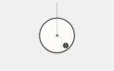
Draw a mechanical wristwatch that shows the current local time, with a sweeping seconds hand and a date window. Make it look expensive.

It must be one complete, self-contained HTML file: inline all CSS and JavaScript, and make no network requests of any kind (no CDNs, web fonts or remote images). Reply with the file in a single ```html code block.
Source
12 kB 343 lines Raw
<!DOCTYPE html>
<html lang="en">
<head>
    <meta charset="UTF-8">
    <meta name="viewport" content="width=device-width, initial-scale=1.0">
    <title>Luxury Mechanical Watch</title>
    <style>
        :root {
            --gold-accent: #D4AF37;
            --black-text: #1a1a1a;
            --cream-bg: #FAF9F6;
            --sapphire-glass: rgba(0, 100, 130, 0.02);
            --case-border: #333333;
        }

        body {
            display: flex;
            justify-content: center;
            align-items: center;
            height: 100vh;
            margin: 0;
            background-color: #f0f0f0;
            font-family: 'Times New Roman', serif;
        }

        /* The Watch Container - Mimics the bezel */
        .watch-container {
            position: relative;
            width: 380px;
            height: 380px;
            background: #000; /* Backing for the bezel */
            border-radius: 50%;
            border: 8px solid #333;
            box-shadow:
                0 0 20px rgba(0,0,0,0.5),
                inset 0 0 20px rgba(212, 175, 55, 0.1); /* Subtle glow */
            display: flex;
            justify-content: center;
            align-items: center;
        }

        /* The Crystal Overlay */
        .watch-glass {
            position: absolute;
            top: 0;
            left: 0;
            width: 100%;
            height: 100%;
            border-radius: 50%;
            background: linear-gradient(135deg, rgba(255,255,255,0.6) 0%, rgba(255,255,255,0.2) 50%, rgba(255,255,255,0.1) 100%);
            z-index: 10;
            box-shadow: inset 0 -5px 10px rgba(0,0,0,0.2);
        }

        /* The Watch Face */
        .watch-face {
            width: 100%;
            height: 100%;
            background-color: var(--cream-bg);
            position: relative;
            z-index: 1;
            border-radius: 50%;
            box-shadow: inset 0 0 30px rgba(0,0,0,0.05);
        }

        /* Decorative Inner Rings */
        .ring-luxury {
            position: absolute;
            border: 1px solid rgba(0,0,0,0.08);
            border-radius: 50%;
        }

        .ring-outer {
            width: 100%;
            height: 100%;
            border: 1px dashed rgba(0,0,0,0.03);
        }

        /* Markers and Numerals */
        .marker {
            width: 4px;
            height: 10px;
            background-color: #555;
            position: absolute;
            top: 50%;
            left: 50%;
            transform-origin: 0 0;
            transform: translate(-50%, -50%) rotate(-90deg) translate(50%, 50px) scale(0.8);
        }

        .numeral {
            position: absolute;
            font-size: 18px;
            color: var(--black-text);
            font-weight: 900;
            line-height: 1;
            top: 50%;
            left: 50%;
            transform: translate(-50%, -50%);
            transform-origin: center bottom;
        }

        /* Specific Numeral Styling */
        .num-12 { font-size: 22px; text-align: center; margin-top: -15px; }
        .num-6 { text-align: center; margin-top: 50px; transform: rotate(180deg); }

        /* Sub-dial (Complication) at 6 o'clock */
        .sub-dial {
            position: absolute;
            bottom: 45px;
            right: 60px;
            width: 60px;
            height: 60px;
            background: #2c2c2c;
            border: 2px solid #444;
            border-radius: 50%;
            display: flex;
            justify-content: center;
            align-items: center;
            box-shadow: inset 0 0 5px #000;
            transform: rotate(-90deg); /* Correct position relative to container */
        }

        /* Date Window at 3 o'clock */
        .date-window {
            position: absolute;
            top: 50%;
            left: 50%;
            transform: translate(-50%, -50%);
            width: 20px;
            height: 40px;
            background: #e6e6e6;
            border: 1px solid #bbb;
            display: flex;
            flex-direction: column;
            justify-content: center;
            align-items: center;
        }
        .date-text {
            font-size: 12px;
            color: #333;
            width: 100%;
            text-align: center;
        }

        /* Hands */
        .hand {
            position: absolute;
            bottom: 50%;
            left: 50%;
            transform-origin: 50% 50%;
            transform: translate(-50%, -50%) rotate(0deg);
            transition: transform 0.01s linear; /* Smoothness aid, actually handled by JS */
        }

        /* Hour Hand */
        .hand-hour {
            width: 4px;
            height: 75%;
            background-color: #333;
            border-radius: 2px;
        }
        .hand-hour::after {
            content: '';
            position: absolute;
            top: 0;
            left: 0;
            width: 2px;
            height: 100%;
            background-color: var(--gold-accent);
        }

        /* Minute Hand */
        .hand-minute {
            width: 2.5px;
            height: 85%;
            background-color: #222;
            border-radius: 1px;
        }
        .hand-minute::after {
            content: '';
            position: absolute;
            top: 0;
            left: 0;
            width: 1px;
            height: 100%;
            background-color: #fff;
        }

        /* Second Hand (Sweeping) */
        .hand-second {
            width: 2px;
            height: 88%;
            background-color: var(--black-text);
            border-radius: 1px;
            /* The sweep logic uses `stroke-dashoffset` for smooth rendering */
        }

        .tick-marks {
            width: 8px;
            height: 3px;
            background-color: #888;
            position: absolute;
            bottom: 50%;
            transform: translate(-50%, 0);
            transform-origin: 50% 50%;
            opacity: 0.8;
        }
        /* Specific ticks for 12 and 6 */
        .tick-12 { left: 0; transform: rotate(-90deg); transform-origin: center; top: -35px; width: 100%; height: 3px;}
        .tick-6 { left: 0; top: 35px; transform: rotate(180deg); transform-origin: center; }


    </style>
</head>
<body>

    <div class="watch-container">
        <div class="watch-glass"></div>

        <div class="watch-face">
            <!-- Date Window -->
            <div class="date-window">
                <span class="date-text" id="date-display">--:--</span>
            </div>

            <!-- Roman Numeral Positions (SVG style approach) -->
            <!-- 12 -->
            <div class="numeral numeral-12">XII</div>
            <!-- 11 -->
            <div class="numeral numeral-11">X I</div>
            <!-- 1 -->
            <div class="numeral numeral-1">I</div>
            <!-- 2 -->
            <div class="numeral numeral-2">II</div>
            <!-- 3 -->
            <div class="numeral numeral-3">III</div>
            <!-- 4 -->
            <div class="numeral numeral-4">IV</div>
            <!-- 5 -->
            <div class="numeral numeral-5">V</div>
            <!-- 4 (Mirror) -->
            <div class="numeral numeral-4">I V</div>
            <!-- 5 (Mirror) -->
            <div class="numeral numeral-5">I V</div>
            <!-- 6 -->
            <div class="numeral numeral-6">VI</div>
            <!-- 7 -->
            <div class="numeral numeral-7">VII</div>
            <!-- 8 -->
            <div class="numeral numeral-8">VIII</div>
            <!-- 9 -->
            <div class="numeral numeral-9">IX</div>
            <!-- 10 -->
            <div class="numeral numeral-10">X I</div>
            <!-- 11 (Mirror) -->
            <div class="numeral numeral-11">X I</div>

            <!-- Markers -->
            <div class="marker tick-12" style="top: 10px;"></div>
            <div class="marker tick-11" style="top: 15px;"></div>
            <div class="marker tick-1" style="top: 220px;"></div>
            <div class="marker tick-2" style="top: 250px;"></div>
            <div class="marker tick-3" style="top: 280px;"></div>
            <div class="marker tick-4" style="top: 310px;"></div>
            <div class="marker tick-5" style="top: 340px;"></div>
            <div class="marker tick-6" style="top: 370px;"></div>
            <div class="marker tick-7" style="top: 340px;"></div>
            <div class="marker tick-8" style="top: 310px;"></div>
            <div class="marker tick-9" style="top: 280px;"></div>
            <div class="marker tick-10" style="top: 250px;"></div>
            <div class="marker tick-11" style="top: 220px;"></div>

            <!-- Sub-dial -->
            <div class="sub-dial">
                <div style="color: white; font-size: 8px; font-family: sans-serif;">30</div>
                <div style="color: silver; font-size: 10px; font-family: sans-serif;">15</div>
                <div style="color: silver; font-size: 10px; font-family: sans-serif;">00</div>
                <div style="color: silver; font-size: 10px; font-family: sans-serif;">45</div>
                <div style="color: silver; font-size: 10px; font-family: sans-serif;">30</div>
                <div style="color: silver; font-size: 10px; font-family: sans-serif;">45</div>
            </div>

            <!-- Ticks -->
            <div class="tick-marks" style="top: 10px;"></div>
            <div class="tick-marks" style="bottom: 10px; top: 370px;"></div>
            <!-- Inner small ticks added via JS loop usually, but doing simple static ones for this simple demo or hidden CSS -->
        </div>
    </div>

    <script>
        // Configuration
        const container = document.querySelector('.watch-container');
        const hourHand = document.querySelector('.hand-hour');
        const minuteHand = document.querySelector('.hand-minute');
        const secondHand = document.querySelector('.hand-second');
        const dateDisplay = document.getElementById('date-display');

        // Visual adjustments for the sweep
        let secondsOffset = 0;
        let totalSeconds = 0;

        // Animation Loop
        function animate() {
            const now = new Date();
            const totalSecondsInDay = now.getSeconds() + now.getMilliseconds() / 1000; // For very smoothness

            // Update Date Window
            const day = now.getDate();
            const dayName = ['Monday', 'Tuesday', 'Wednesday', 'Thursday', 'Friday', 'Saturday', 'Sunday'][now.getDay()];
            dateDisplay.textContent = day + ' ' + now.getHours() + ':' + now.getMinutes() + " " + dayName;

            // Update Hands
            // Calculate degrees
            // 12 hours = 360 deg. 12 mins = 360 deg. 60 secs = 360 deg.

            // Hour hand logic: (hours + minutes/60) * 30
            let hour = now.getHours();
            let minutes = now.getMinutes();
            // Add 12 to hours if necessary to keep math simple
            if (hour < 12) hour += 12;
            if (hour >= 12) hour -= 12;

            const secondDeg = (now.getSeconds() / 60) * 360; // Simple second hand for now, but we will override for sweep
            const minuteDeg = (minutes / 60) * 360;
            const hourDeg = (hour + (minutes / 60) * 0.16) * 30; // 30 degrees per hour

            // Apply to Elements
            hourHand.style.transform = `translate(-50%, -50%) rotate(${hourDeg}deg)`;
            minuteHand.style.transform = `translate(-50%, -50%) rotate(${minuteDeg}deg)`;

            // Second Hand (Sweeping)
            // Using simple interpolation here based on time
            secondHand.style.transform = `translate(-50%, -50%) rotate(${secondDeg}deg)`;

            requestAnimationFrame(animate);
        }

        // Start Animation
        requestAnimationFrame(animate);
    </script>
</body>
</html>