Run details
- Model
- thinkingmachines/inkling-2-mini
- Route
- OpenRouter API, one user message
- Served by
- PrimeIntellect
- Effort
- high, OpenRouter's default for this model
- Limits
- 60 min · 65,536 output tokens (the model's limit)
- Date
- 21 Nov 2026
- Time
- 8 min 49 s
- Size
- 14 kB
- Tokens
- 97 in, 28,221 out (21,875 of them thinking)
- List price
- $0.008 at today's price ($0.075 in / $0.30 out per M)
- Paid
- $0.010
Exact prompt
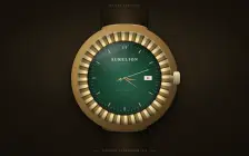
Draw a mechanical wristwatch that shows the current local time, with a sweeping seconds hand and a date window. Make it look expensive.

It must be one complete, self-contained HTML file: inline all CSS and JavaScript, and make no network requests of any kind (no CDNs, web fonts or remote images). Reply with the file in a single ```html code block.
Source
14 kB 338 lines Raw
<!DOCTYPE html>
<html lang="en">
<head>
<meta charset="UTF-8"/>
<meta name="viewport" content="width=device-width, initial-scale=1"/>
<title>Aurelion — Automatic</title>
<style>
  :root{
    --size: clamp(300px, min(84vw, 70vh), 520px);
    --gold-hi:#f8e7b6; --gold:#d9b165; --gold-deep:#5e451f;
  }
  *{ box-sizing:border-box; margin:0; padding:0; }
  html,body{ height:100%; }
  body{
    font-family: Georgia, 'Times New Roman', serif;
    background:
      radial-gradient(85% 60% at 50% 38%, rgba(221,181,98,.13), rgba(0,0,0,0) 60%),
      radial-gradient(120% 120% at 50% 45%, #241d14 0%, #15100a 52%, #070504 100%);
    overflow:hidden;
    user-select:none;
    -webkit-user-select:none;
  }
  .stage{
    position:relative; width:100%; height:100dvh;
    display:flex; align-items:center; justify-content:center;
  }

  /* ---------- strap ---------- */
  .strap{
    position:absolute; left:50%; transform:translateX(-50%);
    width:calc(var(--size) * .47); z-index:1;
    background:
      linear-gradient(90deg, rgba(0,0,0,.55), rgba(0,0,0,0) 16%, rgba(255,218,160,.11) 50%, rgba(0,0,0,0) 84%, rgba(0,0,0,.55)),
      linear-gradient(90deg, #170f08 0%, #2d2013 40%, #3b2b1a 50%, #2d2013 60%, #130c06 100%);
  }
  .strap.top{
    top:-3%; height:53%;
    -webkit-mask-image:linear-gradient(180deg, transparent, #000 48%);
    mask-image:linear-gradient(180deg, transparent, #000 48%);
  }
  .strap.bottom{
    bottom:-3%; height:53%;
    -webkit-mask-image:linear-gradient(0deg, transparent, #000 48%);
    mask-image:linear-gradient(0deg, transparent, #000 48%);
  }
  .strap::before,.strap::after{
    content:""; position:absolute; top:0; bottom:0;
    border-left:2px dashed rgba(228,196,140,.38);
  }
  .strap::before{ left:9px; }
  .strap::after{ right:9px; border-left:none; border-right:2px dashed rgba(228,196,140,.38); }
  .keeper{
    position:absolute; left:50%; top:18%; transform:translateX(-50%);
    width:126%; height:20px; border-radius:7px; z-index:2;
    background:linear-gradient(180deg,#42311e,#221709);
    box-shadow: inset 0 2px 3px rgba(255,220,160,.28), 0 4px 8px rgba(0,0,0,.55);
  }

  /* ---------- watch head ---------- */
  .watch{ position:relative; z-index:3; width:var(--size); height:var(--size); flex:0 0 auto; }
  .lug{
    position:absolute; left:50%; transform:translateX(-50%);
    width:46%; height:7%; z-index:2;
    border-radius:46% 46% 30% 30% / 72% 72% 26% 26%;
    background:linear-gradient(180deg,#eccf8d,#4e3a17);
    box-shadow: inset 0 -3px 4px rgba(0,0,0,.45), 0 2px 4px rgba(0,0,0,.4);
  }
  .lug.top{ top:-3.2%; }
  .lug.bottom{ bottom:-3.2%; transform:translateX(-50%) scaleY(-1); }
  .lug::after{
    content:""; position:absolute; left:16%; right:16%; top:50%;
    height:2px; background:rgba(0,0,0,.35); border-radius:2px;
  }

  .case{
    position:absolute; inset:0; z-index:3; border-radius:50%;
    background: radial-gradient(circle at 36% 30%, #f9e9bd, #ddb876 28%, #8f6c37 60%, #493517 100%);
    box-shadow:
      inset 0 2px 5px rgba(255,244,206,.9),
      inset 0 -7px 14px rgba(38,24,6,.75);
  }
  .case::before{
    content:""; position:absolute; inset:-2.6%; z-index:-1; border-radius:50%;
    background: radial-gradient(circle at 38% 32%, #e6c37c, #96703a 46%, #46331a 78%, #221906);
    box-shadow: 0 34px 70px rgba(0,0,0,.62), 0 10px 22px rgba(0,0,0,.5);
  }
  .bezel{
    position:absolute; inset:3.6%; border-radius:50%;
    background:
      radial-gradient(circle at 50% 50%, transparent 60%, rgba(0,0,0,.34) 68%, transparent 74%),
      repeating-conic-gradient(from -4deg, #f6e2ad 0deg 4.5deg, #9c7a3c 4.5deg 8.5deg, #5e451f 8.5deg 10deg);
    box-shadow:
      inset 0 2px 4px rgba(255,246,214,.85),
      inset 0 -5px 8px rgba(32,21,6,.8),
      inset 0 0 20px rgba(0,0,0,.35),
      0 1px 3px rgba(0,0,0,.5);
  }
  .dial{
    position:absolute; inset:10.6%; border-radius:50%; overflow:hidden;
    background:
      repeating-conic-gradient(from 0deg, rgba(255,255,255,.055) 0deg 1.7deg, rgba(0,0,0,0) 1.7deg 3.4deg),
      radial-gradient(circle at 50% 50%, #235f45 0%, #143d2b 46%, #081f14 80%, #030f09 100%);
    box-shadow:
      inset 0 6px 18px rgba(0,0,0,.8),
      inset 0 -2px 6px rgba(255,255,255,.06),
      0 0 0 1px rgba(0,0,0,.6),
      0 0 0 4px rgba(0,0,0,.28);
  }
  #dialSvg{ position:absolute; inset:0; width:100%; height:100%; display:block; }
  .glare{
    position:absolute; inset:0; border-radius:50%; pointer-events:none; z-index:6;
    background:
      radial-gradient(58% 42% at 33% 22%, rgba(255,255,255,.22), rgba(255,255,255,0) 62%),
      radial-gradient(42% 58% at 72% 80%, rgba(140,210,180,.07), rgba(0,0,0,0) 70%);
  }
  .glare::after{
    content:""; position:absolute; top:-24%; left:-34%; width:125%; height:52%;
    transform:rotate(-24deg) scaleY(.6);
    background:linear-gradient(90deg, rgba(255,255,255,0), rgba(255,255,255,.16), rgba(255,255,255,0));
    filter:blur(7px);
  }

  .crown{
    position:absolute; z-index:4; right:-4.8%; top:50%;
    width:6.6%; height:12.5%; transform:translateY(-50%);
    border-radius:24%;
    background:
      linear-gradient(180deg, rgba(255,244,205,.9), rgba(0,0,0,.4)) ,
      repeating-linear-gradient(90deg, #f4e2ae 0 2px, #7c5c2a 2px 4px);
    box-shadow: 0 3px 7px rgba(0,0,0,.55), inset 0 1px 2px rgba(255,255,255,.75);
  }
  .crown::before{
    content:""; position:absolute; left:-48%; top:50%; width:62%; height:36%;
    transform:translateY(-50%); border-radius:3px;
    background:linear-gradient(180deg,#caa65e,#5e451f);
  }

  /* ---------- captions ---------- */
  .overline{
    position:absolute; top:max(12px, 2.8vh); left:50%; transform:translateX(-50%);
    z-index:5; letter-spacing:.42em; font-size:10px; color:#8a7454;
    text-transform:uppercase; white-space:nowrap;
  }
  .caption{
    position:absolute; left:50%; bottom:max(12px, 2.8vh); transform:translateX(-50%);
    z-index:5; display:flex; align-items:center; gap:14px;
    letter-spacing:.28em; font-size:10.5px; color:#a08a5e;
    text-transform:uppercase; white-space:nowrap;
  }
  .rule{ width:52px; height:1px; flex:0 0 auto; background:linear-gradient(90deg,transparent,#a8853e); }
  .rule:last-child{ background:linear-gradient(90deg,#a8853e,transparent); }

  @media (max-width:520px){
    .overline{ font-size:8px; letter-spacing:.3em; }
    .caption{ font-size:8.5px; letter-spacing:.2em; gap:9px; }
    .rule{ width:30px; }
  }
</style>
</head>
<body>
<main class="stage" aria-label="Mechanical wristwatch showing the current local time">
  <div class="strap top"></div>

  <div class="overline">Maison Aurelion</div>

  <div class="watch">
    <div class="lug top"></div>
    <div class="lug bottom"></div>
    <div class="crown"></div>
    <div class="case">
      <div class="bezel">
        <div class="dial">
          <svg id="dialSvg" viewBox="0 0 500 500" role="img" aria-label="Analog clock face">
            <defs>
              <linearGradient id="hourGold" x1="0" y1="0" x2="1" y2="0">
                <stop offset="0" stop-color="#7c5a26"/>
                <stop offset=".42" stop-color="#f7e3b0"/>
                <stop offset=".58" stop-color="#fff3cf"/>
                <stop offset="1" stop-color="#8a652e"/>
              </linearGradient>
              <linearGradient id="faceDark" x1="0" y1="0" x2="1" y2="0">
                <stop offset="0" stop-color="#4d3712"/>
                <stop offset="1" stop-color="#8a652e"/>
              </linearGradient>
              <linearGradient id="batonGold" x1="0" y1="0" x2="1" y2="0">
                <stop offset="0" stop-color="#503a16"/>
                <stop offset=".5" stop-color="#f4e2ae"/>
                <stop offset="1" stop-color="#503a16"/>
              </linearGradient>
              <radialGradient id="goldMid" cx=".38" cy=".32" r=".95">
                <stop offset="0" stop-color="#fdf0c8"/>
                <stop offset=".55" stop-color="#d9b165"/>
                <stop offset="1" stop-color="#6e5223"/>
              </radialGradient>
              <filter id="soft" x="-25%" y="-25%" width="150%" height="150%">
                <feDropShadow dx="0" dy="3" stdDeviation="2.4" flood-color="#000" flood-opacity="0.5"/>
              </filter>
            </defs>

            <!-- rehaut inner edge -->
            <circle cx="250" cy="250" r="246" fill="none" stroke="#000" stroke-opacity=".55" stroke-width="7"/>
            <circle cx="250" cy="250" r="241.5" fill="none" stroke="#caa25c" stroke-opacity=".55" stroke-width="1.2"/>

            <!-- generated minute track and applied indices -->
            <g id="ticks"></g>
            <g id="indices"></g>

            <!-- brand & legend -->
            <text x="250" y="134" text-anchor="middle" font-family="Georgia, 'Times New Roman', serif" font-size="27" font-weight="600" letter-spacing="5" fill="#efe0b4">AURELION</text>
            <text x="250" y="158" text-anchor="middle" font-family="Georgia, 'Times New Roman', serif" font-size="11" letter-spacing="6" fill="#b39b64">GENÈVE</text>
            <text x="250" y="338" text-anchor="middle" font-family="Georgia, 'Times New Roman', serif" font-size="11.5" letter-spacing="5" fill="#a8894f">AUTOMATIC</text>
            <text x="250" y="364" text-anchor="middle" font-family="Georgia, 'Times New Roman', serif" font-size="8.5" letter-spacing="3" fill="#7c6a46">SWISS MADE</text>

            <!-- date window -->
            <g id="dateG">
              <rect x="383" y="237" width="54" height="30" rx="3.5" fill="#000" opacity=".42"/>
              <rect x="382" y="235" width="54" height="30" rx="3.5" fill="#f2ecd9" stroke="#28200f" stroke-width="1.6"/>
              <rect x="386.5" y="239.5" width="45" height="21" rx="1.5" fill="none" stroke="rgba(0,0,0,.18)" stroke-width="1"/>
              <text id="dateText" x="409" y="257" text-anchor="middle" font-family="Georgia, 'Times New Roman', serif" font-size="20" font-weight="700" fill="#211c10">1</text>
            </g>

            <!-- hour hand -->
            <g id="hourHand" filter="url(#soft)">
              <path d="M250 156 L257.5 245 L250 262 L242.5 245 Z" fill="url(#hourGold)" stroke="#2e2008" stroke-width=".8"/>
              <path d="M250 156 L242.5 245 L250 262 Z" fill="url(#faceDark)" stroke="#2e2008" stroke-width=".5"/>
            </g>
            <!-- minute hand -->
            <g id="minuteHand" filter="url(#soft)">
              <path d="M250 94 L255 242 L250 260 L245 242 Z" fill="url(#hourGold)" stroke="#2e2008" stroke-width=".8"/>
              <path d="M250 94 L245 242 L250 260 Z" fill="url(#faceDark)" stroke="#2e2008" stroke-width=".5"/>
            </g>
            <!-- seconds hand -->
            <g id="secondHand">
              <line x1="250" y1="80" x2="250" y2="302" stroke="#f2e7c6" stroke-width="2.6" stroke-linecap="round"/>
              <circle cx="250" cy="86" r="4.2" fill="#c8412b" stroke="#f2e7c6" stroke-width="1.3"/>
              <circle cx="250" cy="280" r="9.5" fill="url(#goldMid)" stroke="#241a08" stroke-width="1.2"/>
              <circle cx="250" cy="280" r="3" fill="#241a08"/>
            </g>
            <!-- center cap -->
            <circle cx="250" cy="250" r="7.5" fill="url(#goldMid)" stroke="#2e2008" stroke-width="1.1"/>
            <circle cx="250" cy="250" r="2.6" fill="#241a08"/>
          </svg>
          <div class="glare"></div>
        </div>
      </div>
    </div>
  </div>

  <div class="strap bottom"><div class="keeper"></div></div>

  <div class="caption">
    <span class="rule"></span>
    <span id="captionDate">—</span>
    <span class="rule"></span>
  </div>
</main>

<script>
(function(){
  var NS = 'http://www.w3.org/2000/svg';
  var ticks = document.getElementById('ticks');
  var indices = document.getElementById('indices');

  // minute track
  for (var i = 0; i < 60; i++){
    if (i % 5 === 0) continue; // hours carry batons
    var a = i * 6;
    var g = document.createElementNS(NS, 'g');
    g.setAttribute('transform', 'rotate(' + a + ' 250 250)');
    var l = document.createElementNS(NS, 'line');
    l.setAttribute('x1', 250); l.setAttribute('y1', 24);
    l.setAttribute('x2', 250); l.setAttribute('y2', 34);
    l.setAttribute('stroke', '#d9c89a');
    l.setAttribute('stroke-width', '2.2');
    l.setAttribute('stroke-linecap', 'round');
    l.setAttribute('opacity', '.75');
    g.appendChild(l);
    ticks.appendChild(g);
  }

  // applied gold batons (double baton at 12), none at 3 (date window)
  for (var h = 0; h < 12; h++){
    if (h === 3) continue;
    var ang = h * 30;
    var gg = document.createElementNS(NS, 'g');
    gg.setAttribute('transform', 'rotate(' + ang + ' 250 250)');
    var offsets = (h === 0) ? [-8.5, 8.5] : [0];
    for (var k = 0; k < offsets.length; k++){
      var r = document.createElementNS(NS, 'rect');
      r.setAttribute('x', 250 + offsets[k] - 3.5);
      r.setAttribute('y', 30);
      r.setAttribute('width', 7);
      r.setAttribute('height', 28);
      r.setAttribute('rx', 2);
      r.setAttribute('fill', 'url(#batonGold)');
      r.setAttribute('stroke', '#412d10');
      r.setAttribute('stroke-width', '.7');
      gg.appendChild(r);
    }
    indices.appendChild(gg);
  }

  var hourHand = document.getElementById('hourHand');
  var minuteHand = document.getElementById('minuteHand');
  var secondHand = document.getElementById('secondHand');
  var dateText = document.getElementById('dateText');
  var captionDate = document.getElementById('captionDate');
  var lastDay = -1;

  function setDate(now){
    var d = now.getDate();
    if (d !== lastDay){
      lastDay = d;
      dateText.textContent = d;
      captionDate.textContent = now.toLocaleDateString('en-GB', {
        weekday: 'long', day: 'numeric', month: 'long', year: 'numeric'
      });
    }
  }

  function frame(){
    var now = new Date();
    var ms = now.getMilliseconds();
    var s = now.getSeconds() + ms / 1000;
    var m = now.getMinutes() + s / 60;
    var h = (now.getHours() % 12) + m / 60;
    hourHand.setAttribute('transform', 'rotate(' + (h * 30).toFixed(3) + ' 250 250)');
    minuteHand.setAttribute('transform', 'rotate(' + (m * 6).toFixed(3) + ' 250 250)');
    secondHand.setAttribute('transform', 'rotate(' + (s * 6).toFixed(3) + ' 250 250)');
    setDate(now);
    requestAnimationFrame(frame);
  }
  setDate(new Date());
  requestAnimationFrame(frame);
})();
</script>
</body>
</html>