Run details
- Model
- kt/midm-k-3.0-pro
- Route
- OpenRouter API, one user message
- Served by
- KT
- Effort
- the model's default
- Limits
- 60 min · 235,615 output tokens (the model's limit)
- Date
- 14 Nov 2026
- Time
- 5 s
- Size
- 6.4 kB
- Tokens
- 442 in, 2,517 out (142 of them thinking)
- List price
- $0.002 at today's price ($0.20 in / $0.80 out per M)
- Paid
- $0.002
Exact prompt
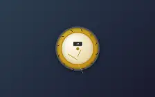
Draw a mechanical wristwatch that shows the current local time, with a sweeping seconds hand and a date window. Make it look expensive.

It must be one complete, self-contained HTML file: inline all CSS and JavaScript, and make no network requests of any kind (no CDNs, web fonts or remote images). Reply with the file in a single ```html code block.
Source
6.4 kB 188 lines Raw
<!DOCTYPE html>
<html lang="ko">
<head>
<meta charset="UTF-8">
<title>고급 기계식 손목시계</title>
<style>
  body {
    margin: 0;
    height: 100vh;
    display: flex;
    justify-content: center;
    align-items: center;
    background: linear-gradient(135deg, #2c3e50, #1a1a2e);
    font-family: 'Segoe UI', Tahoma, Geneva, Verdana, sans-serif;
    color: #f0f0f0;
    overflow: hidden;
  }
  #watch {
    position: relative;
    width: 340px;
    height: 340px;
    background: radial-gradient(circle at 30% 30%, #d4af37, #b8860b);
    border-radius: 50%;
    border: 12px solid #555;
    box-shadow: inset 0 0 20px rgba(0,0,0,0.6),
                0 10px 30px rgba(0,0,0,0.5);
    display: flex;
    justify-content: center;
    align-items: center;
  }
  #dial {
    position: absolute;
    width: 260px;
    height: 260px;
    background: radial-gradient(circle at 30% 30%, #fffdf5, #e0c98b);
    border-radius: 50%;
    border: 8px solid #b8860b;
    display: flex;
    justify-content: center;
    align-items: center;
    box-shadow: inset 0 0 30px rgba(0,0,0,0.2);
  }
  .tick {
    position: absolute;
    width: 4px;
    height: 20px;
    background: #111;
    transform-origin: bottom center;
  }
  .tick:nth-child(1)  { transform: rotate(0deg) translate(110px, -110px); }
  .tick:nth-child(2)  { transform: rotate(30deg) translate(110px, -110px); }
  .tick:nth-child(3)  { transform: rotate(60deg) translate(110px, -110px); }
  .tick:nth-child(4)  { transform: rotate(90deg) translate(110px, -110px); }
  .tick:nth-child(5)  { transform: rotate(120deg) translate(110px, -110px); }
  .tick:nth-child(6)  { transform: rotate(150deg) translate(110px, -110px); }
  .tick:nth-child(7)  { transform: rotate(180deg) translate(110px, -110px); }
  .tick:nth-child(8)  { transform: rotate(210deg) translate(110px, -110px); }
  .tick:nth-child(9)  { transform: rotate(240deg) translate(110px, -110px); }
  .tick:nth-child(10) { transform: rotate(270deg) translate(110px, -110px); }
  .tick:nth-child(11) { transform: rotate(300deg) translate(110px, -110px); }
  .tick:nth-child(12) { transform: rotate(330deg) translate(110px, -110px); }
  .hour-num {
    position: absolute;
    font-family: 'Georgia', serif;
    font-weight: bold;
    font-size: 22px;
    color: #111;
    transform-origin: center;
  }
  .hour-num:nth-child(1)  { transform: rotate(30deg) translate(70px, -70px); }
  .hour-num:nth-child(2)  { transform: rotate(60deg) translate(105px, -105px); }
  .hour-num:nth-child(3)  { transform: rotate(90deg) translate(115px, -115px); }
  .hour-num:nth-child(4)  { transform: rotate(120deg) translate(105px, -105px); }
  .hour-num:nth-child(5)  { transform: rotate(150deg) translate(70px, -70px); }
  .hour-num:nth-child(6)  { transform: rotate(180deg) translate(0px, -65px); }
  .hour-num:nth-child(7)  { transform: rotate(210deg) translate(-70px, -70px); }
  .hour-num:nth-child(8)  { transform: rotate(240deg) translate(-105px, -105px); }
  .hour-num:nth-child(9)  { transform: rotate(270deg) translate(-115px, -115px); }
  .hour-num:nth-child(10) { transform: rotate(300deg) translate(-105px, -105px); }
  .hour-num:nth-child(11) { transform: rotate(330deg) translate(-70px, -70px); }
  .hour-num:nth-child(12) { transform: rotate(0deg) translate(0px, -65px); }
  #date-window {
    position: absolute;
    width: 70px;
    height: 30px;
    background: #2b2b2b;
    border: 2px solid #777;
    border-radius: 4px;
    top: 115px;
    left: 135px;
    display: flex;
    justify-content: center;
    align-items: center;
    font-size: 18px;
    font-weight: bold;
    color: #fff;
    font-family: 'Courier New', Courier, monospace;
    box-shadow: inset 0 0 5px rgba(0,0,0,0.5);
  }
  .hand {
    position: absolute;
    width: 4px;
    background: #111;
    top: 50%;
    left: 50%;
    transform-origin: bottom center;
    border-radius: 2px;
  }
  #hour-hand {
    height: 70px;
    background: #b8860b;
    margin-left: -2px;
  }
  #minute-hand {
    height: 95px;
    background: #b8860b;
    margin-left: -2px;
  }
  #second-hand {
    height: 110px;
    width: 2px;
    background: #e0c98b;
    margin-left: -1px;
    border-radius: 1px;
  }
  #center-cap {
    position: absolute;
    width: 20px;
    height: 20px;
    background: #b8860b;
    border-radius: 50%;
    border: 2px solid #777;
    top: calc(50% - 10px);
    left: calc(50% - 10px);
    z-index: 10;
  }
</style>
</head>
<body>
<div id="watch">
  <div id="dial">
    <!-- Tick marks -->
    <div class="tick"></div><div class="tick"></div><div class="tick"></div><div class="tick"></div><div class="tick"></div><div class="tick"></div>
    <div class="tick"></div><div class="tick"></div><div class="tick"></div><div class="tick"></div><div class="tick"></div><div class="tick"></div>
    <!-- Hour numbers -->
    <div class="hour-num">12</div><div class="hour-num">1</div><div class="hour-num">2</div><div class="hour-num">3</div><div class="hour-num">4</div>
    <div class="hour-num">5</div><div class="hour-num">6</div><div class="hour-num">7</div><div class="hour-num">8</div><div class="hour-num">9</div>
    <div class="hour-num">10</div><div class="hour-num">11</div>
  </div>
  <div id="date-window">--</div>
  <div class="hand" id="hour-hand"></div>
  <div class="hand" id="minute-hand"></div>
  <div class="hand" id="second-hand"></div>
  <div id="center-cap"></div>
</div>

<script>
  // Initialize once clock is ready.
  const hourHand = document.getElementById('hour-hand');
  const minuteHand = document.getElementById('minute-hand');
  const secondHand = document.getElementById('second-hand');
  const dateWindow = document.getElementById('date-window');

  function updateClock() {
    const now = new Date();
    const seconds = now.getSeconds() + now.getMilliseconds() / 1000; // smooth sweep
    const minutes = now.getMinutes() + seconds / 60;
    const hours = (now.getHours() % 12) + minutes / 60;

    const secDeg = seconds * 6;               // 360 / 60
    const minDeg = minutes * 6;               // 360 / 60
    const hourDeg = hours * 30;               // 360 / 12

    secondHand.style.transform = `rotate(${secDeg}deg)`;
    minuteHand.style.transform = `rotate(${minDeg}deg)`;
    hourHand.style.transform = `rotate(${hourDeg}deg)`;

    // Date display (two digits)
    const day = String(now.getDate()).padStart(2, '0');
    dateWindow.textContent = day;
  }

  // Initial call, then every 50ms for smooth motion
  updateClock();
  setInterval(updateClock, 50);
</script>
</body>
</html>